Orange Workflows
Interactive Visualizations
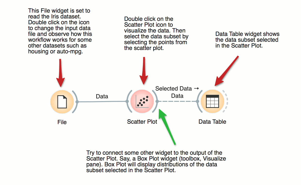
Most visualizations in Orange are interactive. Scatter Plot for example. Double click its icon to open it and click-and-drag to select a few data points from the plot. Selected data will automatically propagate to Data Table. Double click it to check which data was selected. Change selection and observe the change in the Data Table. This works best if both widgets are open.

Visalization of Data Subsets
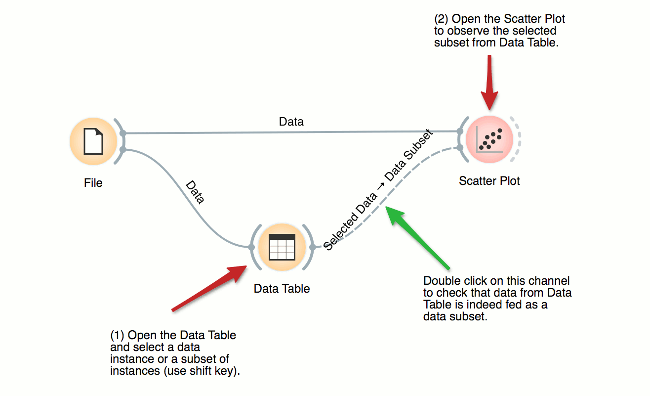
Some visualization widget, like Scatter Plot and several data projection widgets, can expose the data instances in the data subset. In this workflow, Scatter Plot visualizes the data from the input data file, but also marks the data points that have been selected in the Data Table (selected rows).

Inspecting Outliers with Silhouette
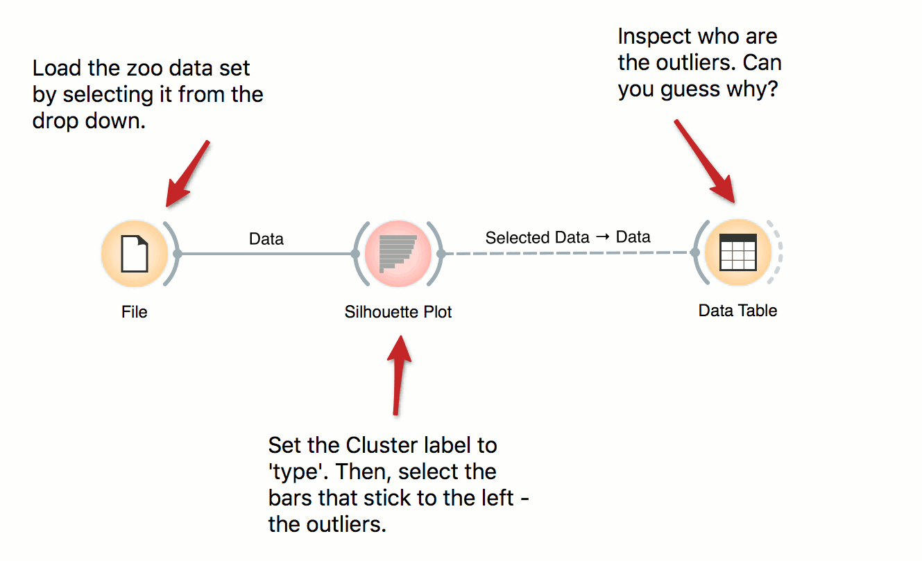
Silhouette Plot shows how ‘well-centered’ each data instance is with respect to its cluster or class label. In this workflow we use iris’ class labels to observe which flowers are typical representatives of their class and which are the outliers. Select instances left of zero in the plot and observe which flowers are these. Try connecting the selection with the Scatter Plot to highlight the outliers.

