Orange Workflows
Survival Curve Estimation
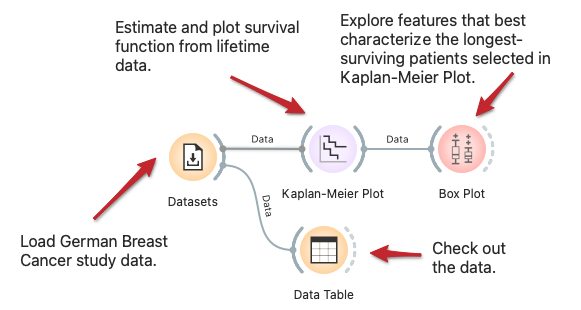
One of the primary objectives of survival analysis is to estimate the survival probability from observed survival times of different patients. The workflow plots the Kaplan-Meier approximation of the survival curve for the investigated population in the German breast cancer study group. The Kaplan-Meier plot is interactive; we select the longest-surviving patients and use Box Plot to analyze features that best characterize them.
Exploring Survival Features
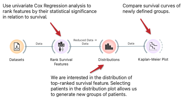
In the workflow, we show how to find and analyze variables related to survival. We start with variables ranked by univariate Cox regression analysis, where we can select the feature of interest. The Distribution widget shows its distribution and allows us to choose interactively a group of patients related to its values. We compare the survival of this group to all other patients in the Kaplan-Meier plot widget.
Cohort Construction and Validation
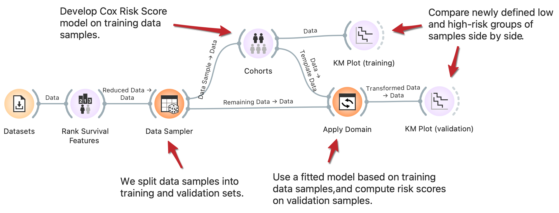
Stratification of patients into low and high-risk groups is a common task in survival analysis to identify clinical and biological factors that contribute to survival. One approach to stratification is by computing risk score values based on the Cox regression model. With the clever use of Orange widgets, we can split the data into training and validation sets and then interactively generate risk score models on training data to observe the difference in cohorts’ survival rate on training and validation samples side-by-side. Read more on how Apply domain enables this kind of workflows.
Cross Validation for Survival Models
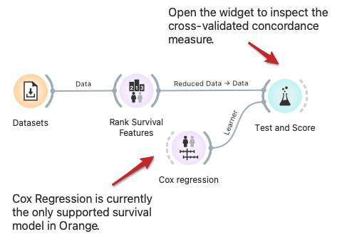
Orange built-in methods for testing and scoring the predictive models now support survival-related models like Cox regression. Here we demonstrate cross-validation to estimate the concordance index for the Cox regression model trained on data instances from selected features.
Explore Subpopulations with Distinct Risk Profiles
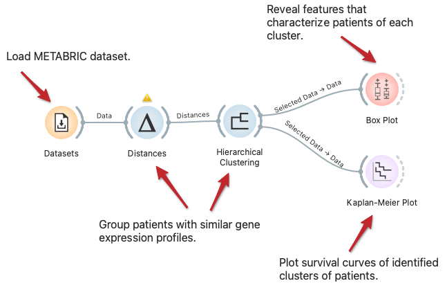
We can visualize the difference in subpopulations of breast cancer patients in the METABRIC dataset through clustering, that is, by identifying groups of data instances similar to each other. We can observe the difference in survival rate between clusters with Kaplan-Meier Plot and explore features that characterize patients of each cluster with the Box Plot widget.
