Orange Workflows
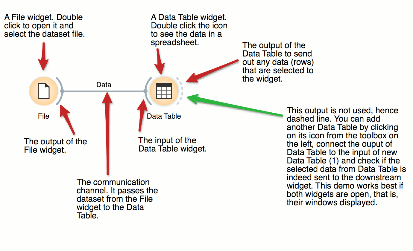
File and Data Table
The basic data mining units in Orange are called widgets. In this workflow, the File widget reads the data. File widget communicates this data to Data Table widget that shows the data in a spreadsheet. The output of File is connected to the input of Data Table.
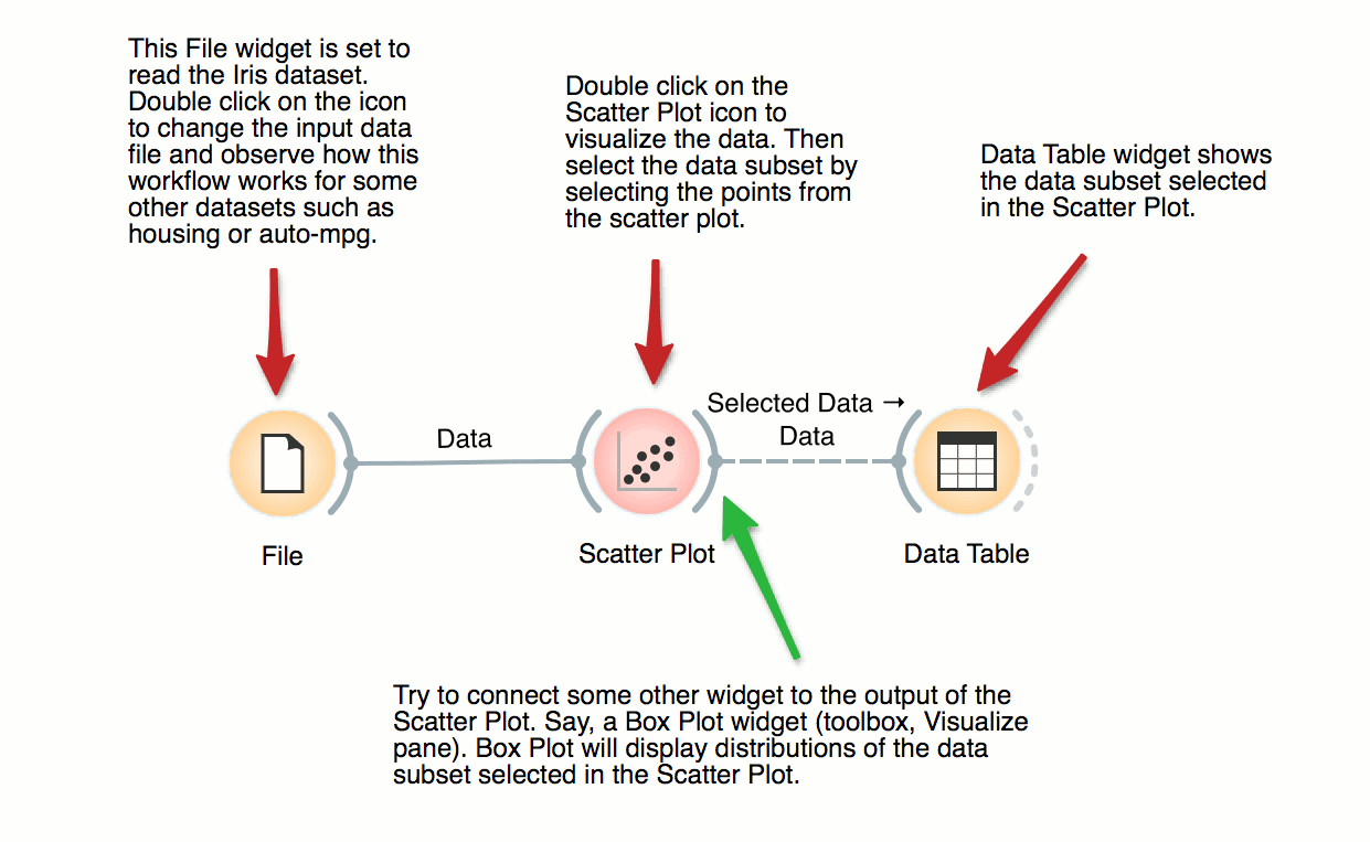
Interactive Visualizations
Most visualizations in Orange are interactive. Scatter Plot for example. Double click its icon to open it and click-and-drag to select a few data points from the plot. Selected data will automatically propagate to Data Table. Double click it to check which data was selected. Change selection and observe the change in the Data Table. This works best if both widgets are open.
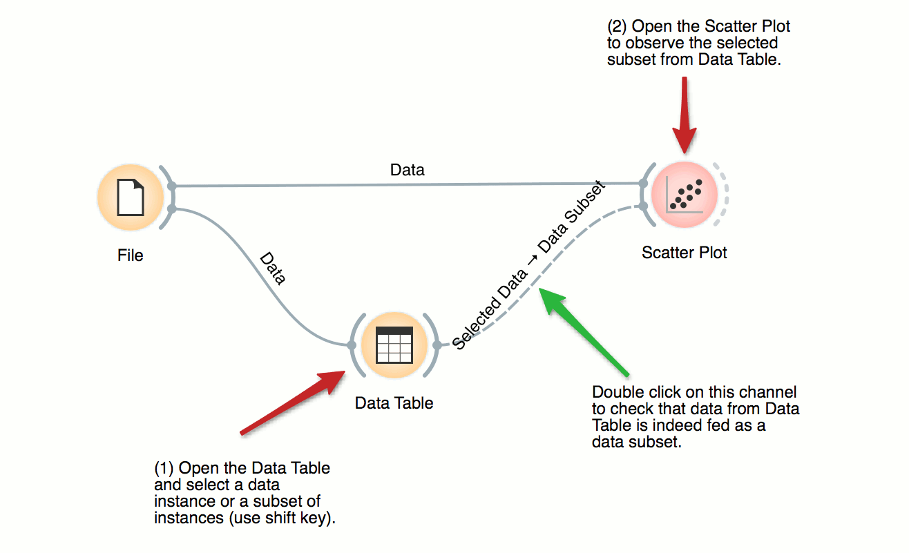
Visalization of Data Subsets
Some visualization widget, like Scatter Plot and several data projection widgets, can expose the data instances in the data subset. In this workflow, Scatter Plot visualizes the data from the input data file, but also marks the data points that have been selected in the Data Table (selected rows).
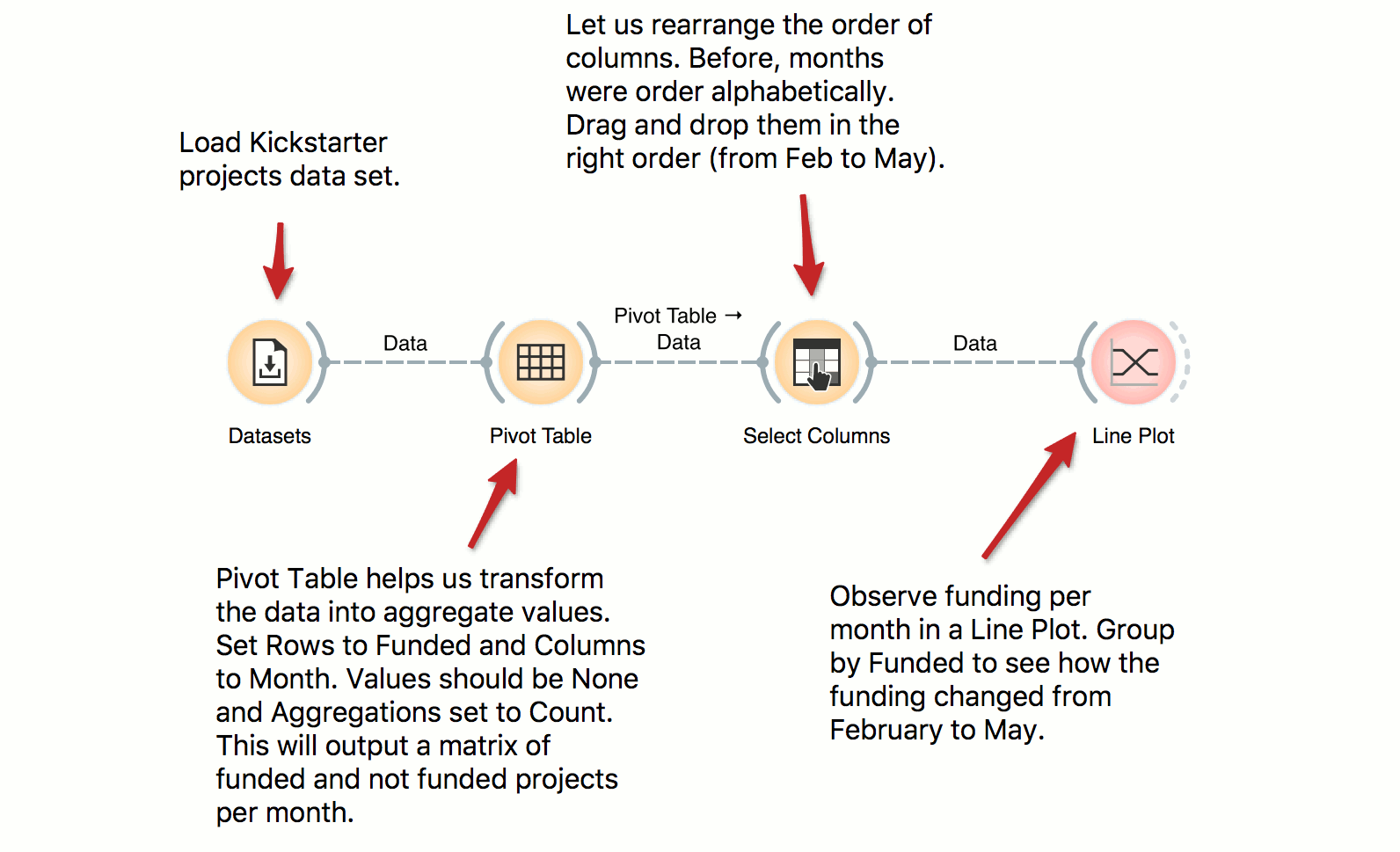
Pivot Table
Pivot Table can help us aggregate and transform the data. This workflow takes Kickstarter projects and aggregates them by month. We can inspect the frequency of the published projects per month and observe the difference between funded and non-funded projects. Try constructing several tables with pivot and experiment with different aggregation methods.
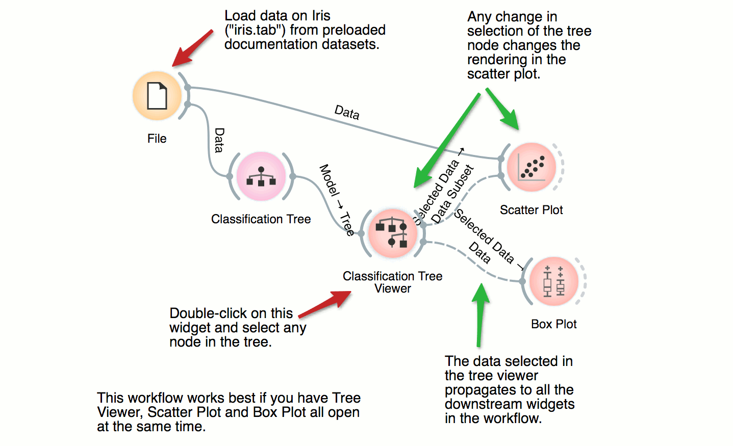
Classification Tree
This workflow combines the interface and visualization of classification trees with scatter plot. When both the tree viewer and the scatter plot are open, selection of any node of the tree sends the related data instances to scatter plot. In the workflow, the selected data is treated as a subset of the entire dataset and is highlighted in the scatter plot. With simple combination of widgets we have constructed an interactive classification tree browser.
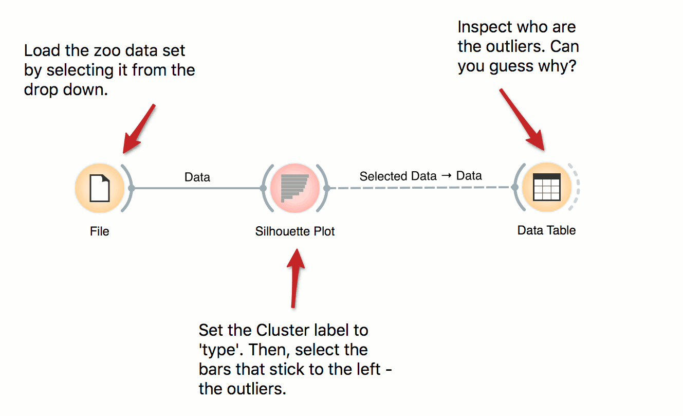
Inspecting Outliers with Silhouette
Silhouette Plot shows how ‘well-centered’ each data instance is with respect to its cluster or class label. In this workflow we use iris’ class labels to observe which flowers are typical representatives of their class and which are the outliers. Select instances left of zero in the plot and observe which flowers are these. Try connecting the selection with the Scatter Plot to highlight the outliers.
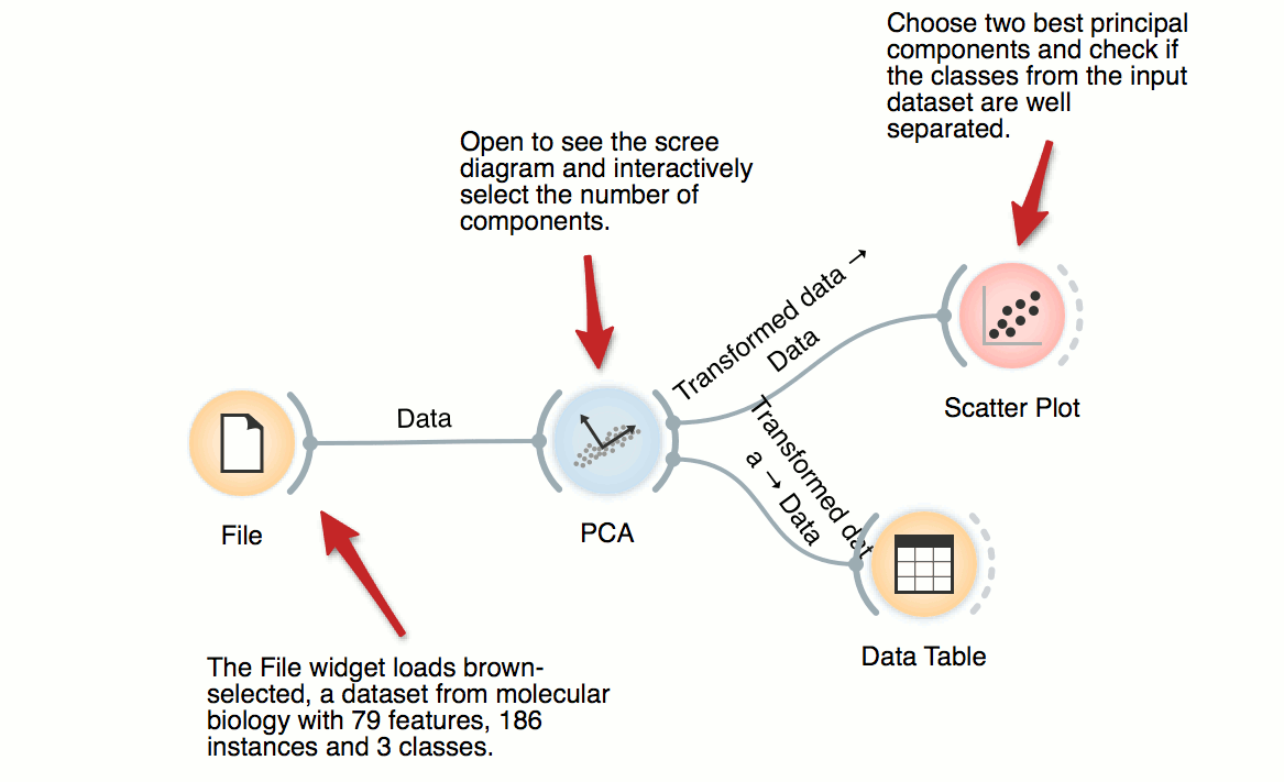
Principal Component Analysis
PCA transforms the data into a dataset with uncorrelated variables, also called principal components. PCA widget displays a graph (scree diagram) showing a degree of explained variance by best principal components and allows to interactively set the number of components to be included in the output dataset. In this workflow, we can observe the transformation in the Data Table and in Scatter Plot.
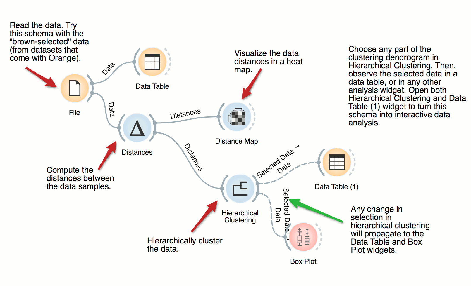
Hierarchical Clustering
The workflow clusters the data items in iris dataset by first examining the distances between data instances. Distance matrix is passed to Hierarchical Clustering, which renders the dendrogram. Select different parts of the dendrogram to further analyze the corresponding data.
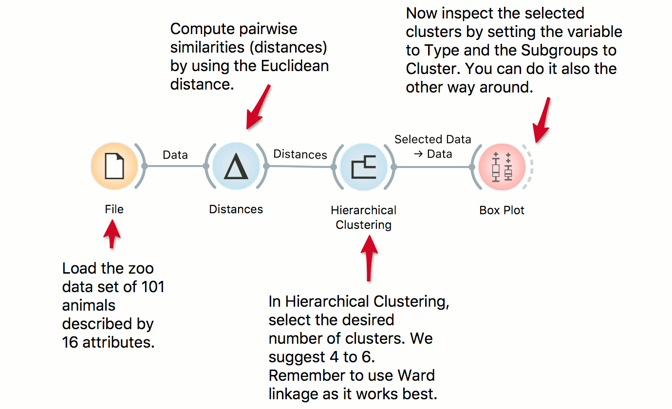
Cluster Inspection
We use the zoo data set in combination with Hierarchical Clustering to discover groups of animals. Now that we have the clusters we want to find out what is significant for each cluster! Pass the clusters to Box Plot and use ‘Order by relevance’ to discover what defines a cluster. Seems like they are well-separated by the type, even though the clustering was unaware of the class label!
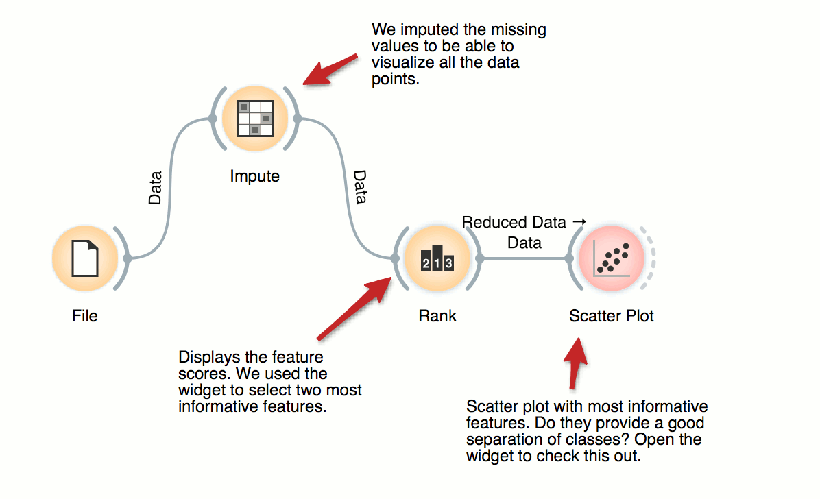
Feature Ranking
For supervised problems, where data instances are annotated with class labels, we would like to know which are the most informative features. Rank widget provides a table of features and their informativity scores, and supports manual feature selection. In the workflow, we used it to find the best two features (of initial 79 from brown-selected dataset) and display its scatter plot.