By: Zala Gruden, May 12, 2022
We have launched a new project on the topic of AI in schools
Read more about the project in the blogpost and Check out the site to find out more about the prepaired activities.
By: Zala Gruden, May 12, 2022
Read more about the project in the blogpost and Check out the site to find out more about the prepaired activities.

By: Ajda Pretnar Žagar, Mar 18, 2022
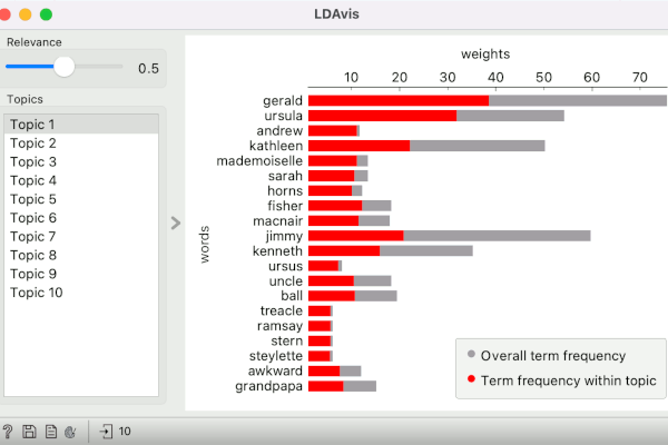
Text add-on recently got extended with LDAvis widget, a visualization that enables exploring word frequencies in LDA-generated topics. See how to construct LDAvis pipeline in Orange.
By: Ajda Pretnar, Dec 17, 2021
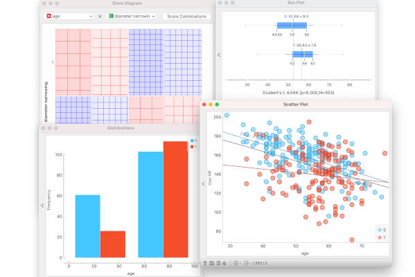
When to use certain visualization and how to read it?
By: Ajda Pretnar, Aug 5, 2021
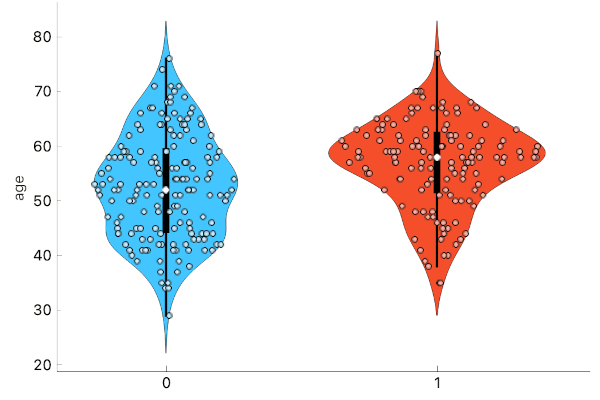
Box plots with an upgrade - violin plots are your new favorite visualization!
By: Andreja Kovačič, Apr 20, 2020
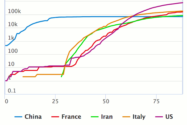
Inspecting and comparing Covid-19 time trends, absolute and relative growth.
By: Robert Cvitkovič, Apr 13, 2020
Visualizing COVID-19 data using area and point maps and interactive timeseries.
By: Ajda Pretnar, Dec 21, 2018
Scatter Plot has recently been renovated (under the hood and in GUI), so now it is time to present some essential tricks for working with the cool visualization!
By: AJDA, Feb 2, 2018
This week, Primož and I flew to the south of Italy to hold a workshop on Image Analytics through Data Mining at AIUCD 2018 conference. The workshop was intended to familiarize digital humanities researchers with options that visual programming environments offer for image analysis. In about 5 hours we discussed image embedding, clustering, finding closest neighbors and classification of images. While it is often a challenge to explain complex concepts in such a short time, it is much easier when working with Orange.
By: AJDA, Jan 26, 2018
Scatter plots are great! But sometimes, we need to plot more than two variables to truly understand the data. How can we achieve this, knowing humans can only grasp up to three dimensions? With an optimization of linear projection, of course! Orange recently re-introduced FreeViz, an interactive visualization for plotting multiple variables on a 2-D plane. Let’s load zoo.tab data with File widget and connect FreeViz to it. Zoo data has 16 features describing animals of different types - mammals, amphibians, insects and so on.
By: THOCEVAR, Dec 23, 2017
The Orange3 Network add-on contains a convenient Network Explorer widget for network visualization. Orange uses an iterative force-directed method (a variation of the Fruchterman-Reingold Algorithm) to layout the nodes on the 2D plane. The goal of force-directed methods is to draw connected nodes close to each other as if the edges that connect the nodes were acting as springs. We also don’t want all nodes crowded in a single point, but would rather have them spaced evenly.