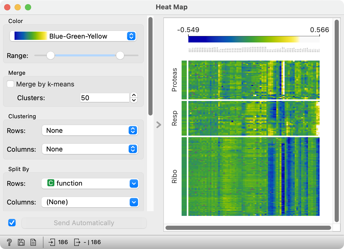
This post is not about the Heat Map widget. It’s about the new double-handled slider at the top of the heatmap. Not about what it does, but about how it does it. The post should be interesting to readers with some knowledge of Qt. Others, who won’t understand it, are expected to be impressed by the complexity of implementing something as simple as adding another handle to a slider. On the other hand (wait for the pun!), this complexity is not so surprising: attaching another, fully functional hand to a human would be quite a feat, too.
Why do we need it?
That is, why we need another handle on slider, not another hand. (Though an extra hand would be useful, too - how cool would it be to take a sip of tea while typing?)
A user posted an issue, which he called “Not a problem. More a frustration”. Some widgets from the Text add-on allow the user to specify a range of values, for instance for filtering, which they do with a pair of spin boxes (those controls where you can enter a number manually or change it by pressing little up and down button on their right) or a pair of sliders. He suggested using a single slider with two handles. He noted that Orange currently doesn’t have such a control in its repertoire.
With a bit of exaggeration, I use such sliders almost daily to specify the price range when ordering bicycle parts, tools and clothes. While I’m no stranger to such sliders, I don’t particularly like them. Entering numbers manually is much easier. But then … they could be useful in cases where numbers are not intepretable, so sliding a handle is more natural than guessing random numbers. A good example is setting scales for color palettes: the user has no idea which particular number will make the image look good.
Drawing native-looking widgets
Problem: Qt doesn’t have such widget.
Qt is great - consistent, fast, powerful, and it has native look on all platforms. But if you want to make any small change to some element, its painting falls back to a Qt-based implementation which looks … not only out of place but, well, ugly. See what becomes of a push button if you would, for whatever reason, want to increase its font size.

So, can we create a double-handled slider that looks as it should? Not with some ugly square-ish handles?
OP provided us with a link to implementation of such a slider. Our version is different, but based on the same trick.
Widget is (re)painted upon receiving a paintEvent. It must construct a painter, initialize it with proper options and paint whatever needs to be painted. QPushButton, QCheckBox, QLineEdit … and many other widgets must look different on different platforms. The actual painting is thus not coded within widgets, but relegated to QStyle. QStyle is however an class: the actual QStyle in use by the application is one of QStyle’s subclasses for different platforms and looks.
For instance, QPushButton.paintEvent just calls QStyle’s drawControl(QStyle.CE_PushButton, option, painter), where CE_PushButton is a constant giving the control to paint, option is an instance of QStyleOptionButton with the necessary data (the icon, text and button’s features) and painter is an ordinary QPainter. (The actual code uses a convenience class QStylePainter). drawControl then draws all elements of the button – its text, icon, any frames, borders.
Unlike QPushButton, QSlider is a complex control, consisting of subcontrols that represent the slider’s groove, tickmarks and handle. Complex controls are not painted through QStyle.drawControl but through another method, drawComplexControl. Its signature is similar, but option has a mask subcontrols, which define the active subcontrols. Inactive controls are not painted and the user can’t interact with them.
The trick to paint a two-handled slider is to call drawComplexControl multiple times: first to draw the groove and tickmarks, and then twice, once for each handle. In the code fragment below, self.opt is a QSliderOption. Method drawComplexControl will put a handle at the position stored in self.opt.sliderPosition, hence we iterate it through self._pos, which stores the positions of our two handles.
        # Draw groove and tickmarks
        self.opt.subControls = QStyle.SC_SliderGroove | QStyle.SC_SliderTickmarks
        self.style().drawComplexControl(QStyle.CC_Slider, self.opt, painter)

        # Draw handles
        self.opt.subControls = QStyle.SC_SliderHandle
        for self.opt.sliderPosition in self._pos:
            self.style().drawComplexControl(QStyle.CC_Slider, self.opt, painter)
The code adds some overhead (initializing options) and marks the part of the groove between the two handles in blue.
Controlling controls
Drawing a native looking widget is only one part of the job. What happens when the user clicks it? The widget receives a mousePressEvent - but which part of the widget was clicked? This is known only by the one who’s drawn the control: QStyle.
QStyle implements several methods needed for interaction with complex controls. One is already used in paintEvent: we call QStyle’s subControlRect(QStyle.CC_Slider, self.opt, QStyle.SC_SliderHandle) to obtain the logical coordinates of each handle in order to mark the interval between them.
        args = QStyle.CC_Slider, self.opt, QStyle.SC_SliderHandle
        self.opt.sliderPosition = self._pos[0]
        x_left_handle = self.style().subControlRect(*args).right()
        self.opt.sliderPosition = self._pos[1]
        x_right_handle = self.style().subControlRect(*args).left()
In mousePressEvent, we call hitTestComplexControl(QStyle.CC_Slider, self.opt, event.pos(), self), which tells us which subcontrol (if any) of the slider contains event.pos(). As in paintEvent, we set self.opt.sliderPosition to each handle’s position in turn, to see if hitTestComplexControl returns QStyle.SC_SliderHandle for any of them.
    def mousePressEvent(self, event: QMouseEvent) -> None:
        self._dragged = self.NoHandle
        args = (QStyle.CC_Slider, self.opt, event.pos(), self)
        self.opt.sliderPosition = self._pos[0]
        if self.style().hitTestComplexControl(*args) == QStyle.SC_SliderHandle:
            self._dragged |= self.LowHandle
        self.opt.sliderPosition = self._pos[1]
        if self.style().hitTestComplexControl(*args) == QStyle.SC_SliderHandle:
            self._dragged |= self.HighHandle
        if self._dragged != self.NoHandle:
            self.sliderPressed.emit(self._dragged)
The code then records which handles are being dragged (if they overlap, both are marked as being dragged until we see whether the user drags left or right).
The third method of QStyle, which we use in mouseEvent determines the slider value from handles position - which is again known only by the class that paints a platform-dependent slider. sliderValueFromPosition is given the slider span, (mouse) position and the total bounding rectangle of the slider, and returns the slider’s value for that position.
        distance = self.opt.maximum - self.opt.minimum
        pos = self.style().sliderValueFromPosition(
            0, distance, event.pos().x(), self.rect().width())
How do we use interval sliders?
Using interval sliders is as trivial as using ordinary QSliders: initialize it with starting position, interval and options (if any), and connect the necessary signals.
        slider = IntervalSlider(low, high * 100, minimum=0, maximum=100)
        self.slider.intervalChanged.connect(self.__on_slider_moved)
Done.
