This is the second part of a blog on archaeological data analysis in Orange. In the first part, we wrote about image analytics and how to predict amphora types. This blog will show a simpler analysis, where we will plot excavation sites onto maps and interpret the results.
Related: Data Mining for Archaeologists, part I
This time we will be working with the pottery data from the Antikythera Survey Project. You can download the data (pottery.csv) or simply copy-paste the below link in the File widget’s URL line.
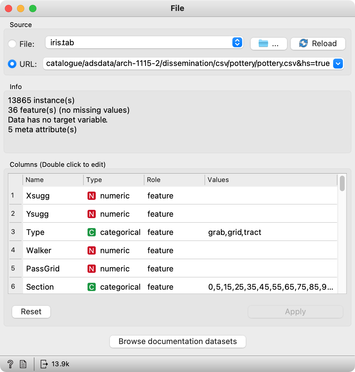
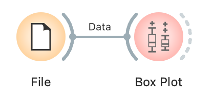
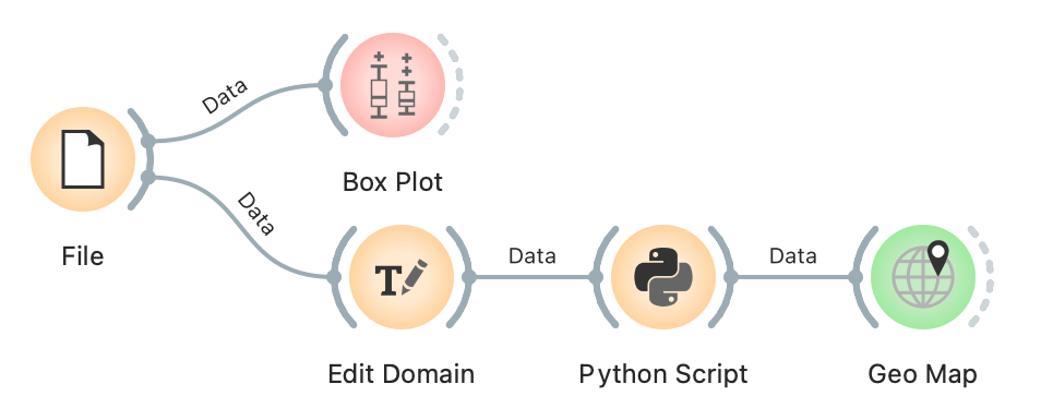
All is well, out data is here. Let us check it in the Box Plot, to see what are the distributions of our features.
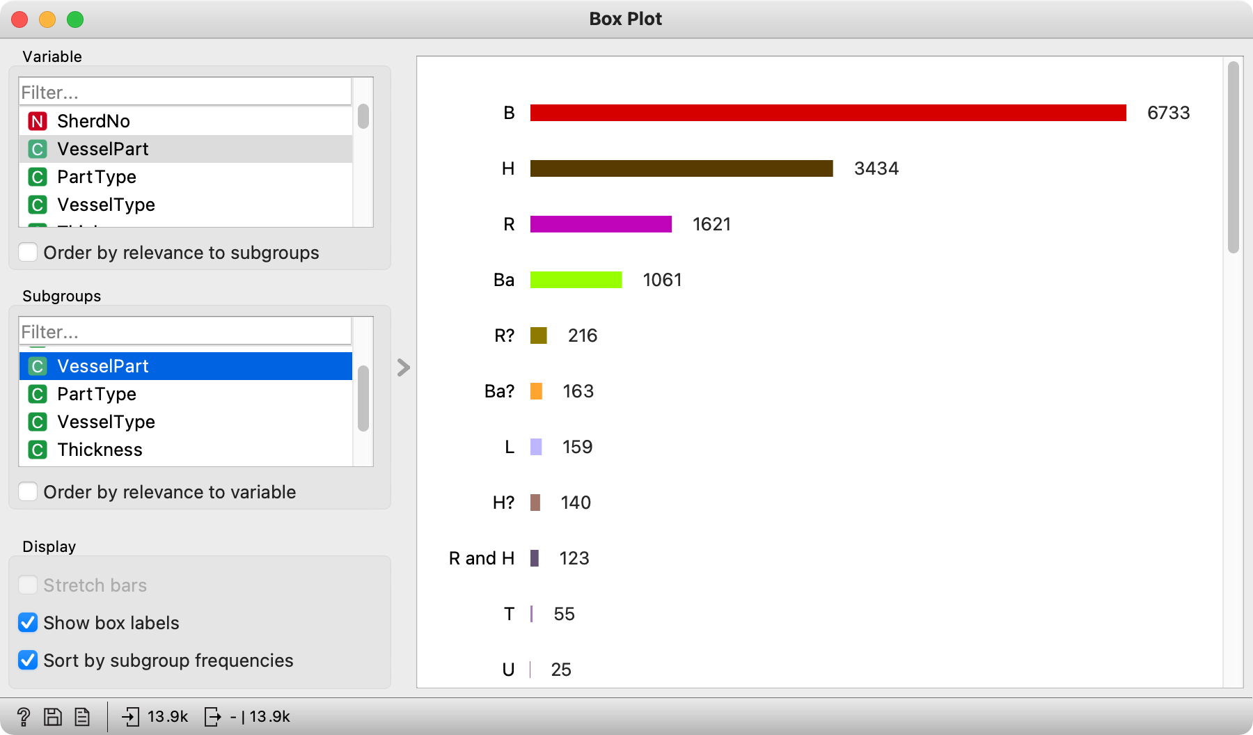
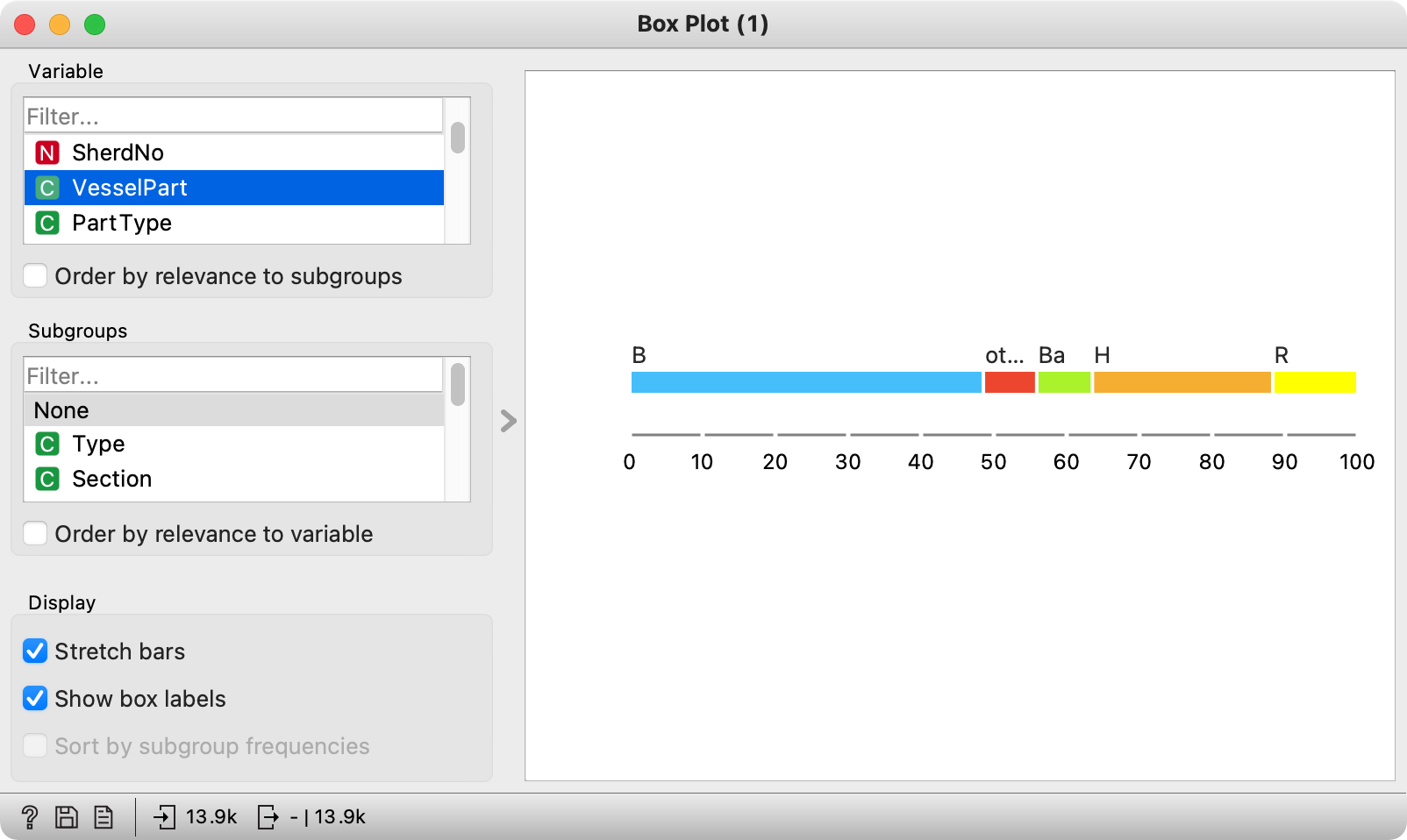
Hmmm, it seems like the VesselPart feature contains a lot of bodies (B), bases (Ba), handles (H) and rims (R), while other shard parts are significantly less represented. Machine learning doesn’t handle discrete features with many values very well, so we will preprocess the data to make it easier to interpret and handle downstream.
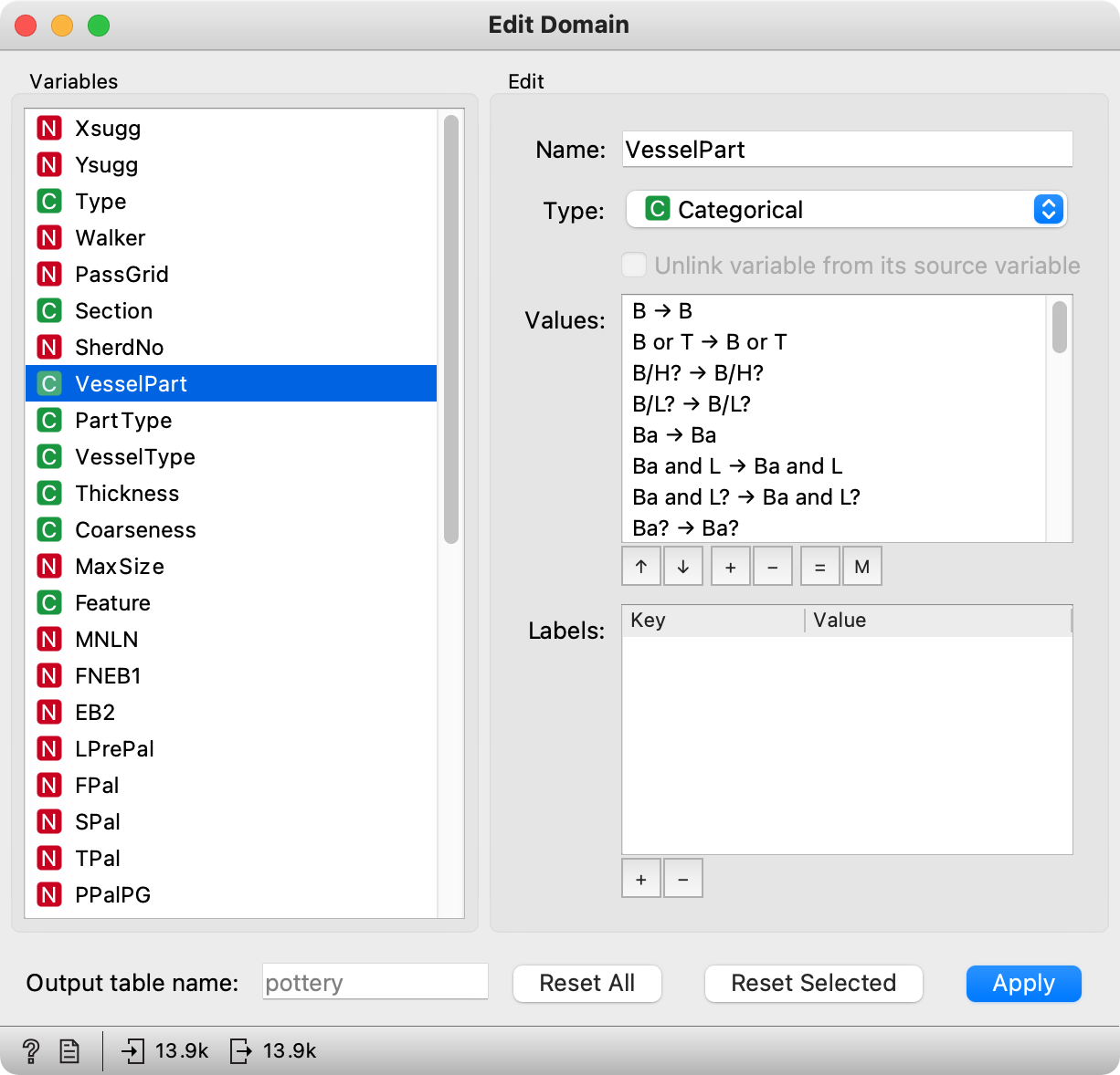
For data preprocessing, we will use Edit Domain. Let us select VesselPart. Feature values will be shown on the right. One option would be to manually merge values together, say Ba? and Ba. We do this by selecting the two values and clicking M in the lower right corner. Group selected values will group them together. Don’t forget to give them a name, say Ba_all.
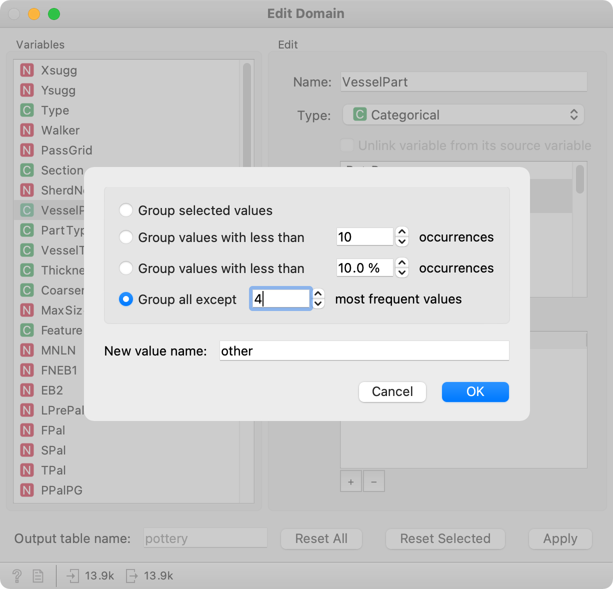
To avoid doing this for a large number of values, Edit Domain offers a nice way to merge infrequent values together. The final option is called Group all except N most frequent values, where we can set the N ourselves. We know from Box Plot there are 4 fairly frequent values, while the others are less frequent. So let us select 4.

In the widget, you will see that all infrequent values are now merged and will appear under the label other. You can do the same for other features. Don’t forget to press Apply once you are done with preprocessing.
Check the results in a Box Plot. Much better!
Now, let us plot the data on a map. You might have noticed the pottery shards have a location, where they were excavated (XSugg and YSugg). Unfortunately, these coordinates are encoded in an EPSG:32634 system, so we will have to transform them to the more common EPSG:4326 projection.
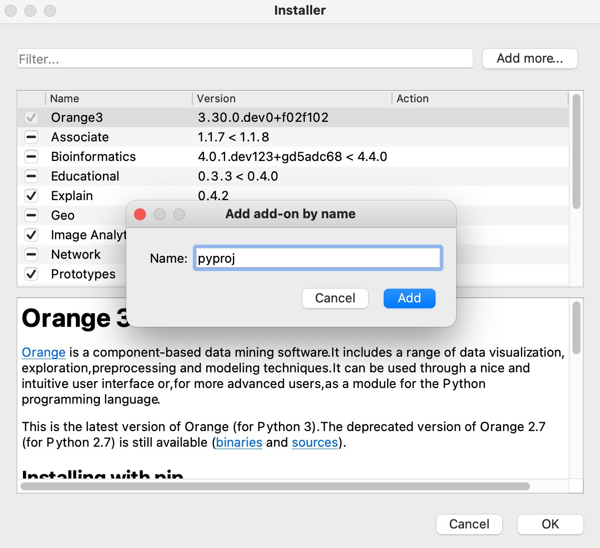
For this, we will need pyproj package, which you can install by going to Options - Add-ons. In the upper right corner, you will see Add more… option. Select it. Now enter pyproj in the field. It will appear in the list of possible add-ons. Select it and run the installation.
Once pyproj is installed, you can use Python Script widget to transform any projection to another one. Copy-paste the below script in the widget and run it.
from pyproj import Transformer
from Orange.data import ContinuousVariable

new_lon = []
new_lat = []
transformer = Transformer.from_crs("epsg:32634", "epsg:4326")

for i in range(len(in_data)):
    lat, lon = transformer.transform(in_data[i][0], in_data[i][1])
    new_lat.append(lat)
    new_lon.append(lon)

out = in_data.add_column(ContinuousVariable("lat"), new_lat)
out_data = out.add_column(ContinuousVariable("lon"), new_lon)
To avoid installing pyproj, here is the transformed data set. Load it with the File widget and continue along.
At last, it is time to plot the data on a map. For this, you will need Geo add-on, which you can also install in Options - Add-ons.
Connect Geo Map widget to Python Script (or directly to the File widget if you are using transformed data). Geo Map will automatically try to find latitude and longitude features. As with most visualizations in Orange, you can use other features to enhance the information gained from the plot. Let us use the VesselPart feature for coloring the points on the map.
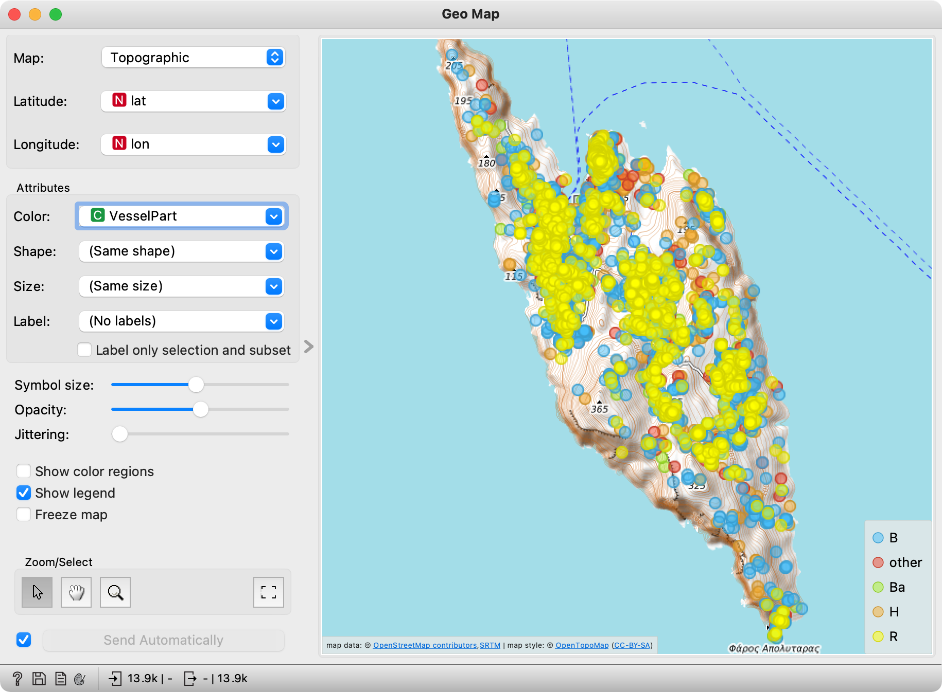
Now for some homework: in which part of the island are located shards from the Hellenic period? (Hint: Use Select Rows and set the Hell value to be higher than 70, then plot the subset on the map.)
