Every week on Friday, when the core team of Orange developers meets, we are designing new improvements of Orange’s graphical interface. This time, it was the status bar. Well, actually, it was the status bar quite a while ago and required the change of the core widget library, but it is materializing these days and you will see the changes in the next release.
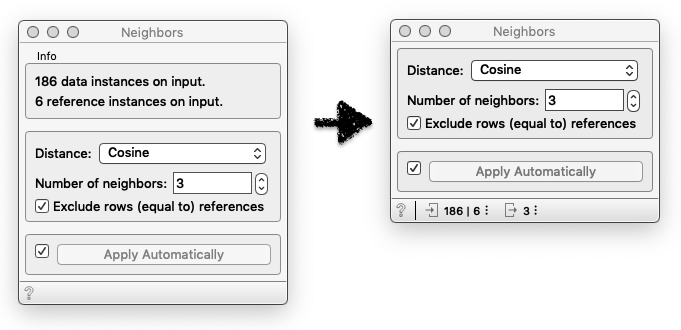
Consider the Neighbors widget. The widget considers the input data and reference data items, and outputs instance form input data that are most similar to the references. Like, if the dolphin is a reference, we would like to know which are the three most similar animals. But this is not what want I wanted to write about. I would only like to say that we are making a slight change in the user interface. Below is the Neighbors widget in the current release of Orange, and the upcoming one.
\

\
See the difference? We are getting rid of the infobox on the top of the control tab, and moving it to the status bar. In the infobox widgets typically display what is in their input and what is on the output after the data has been processed. Moving this information to the status bar will make widgets more compact and less cluttered. We will similarly change the infoboxes in this way in all of the widgets.
