Scatter plots are surely one of the best loved visualizations in Orange. Very often, when we teach, people go back to scatter plots over and over again to see their data. We took people’s love for scatter plots to the heart and we redesigned them a bit to make them even more friendly.
Our favorite still remains the Informative Projections button. This button helps you find interesting visualizations from all the combinations of your data variables. But what does interesting mean? Well, let us look at an example. Which of the two visualizations tells you more about the data?
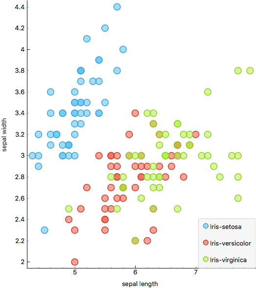
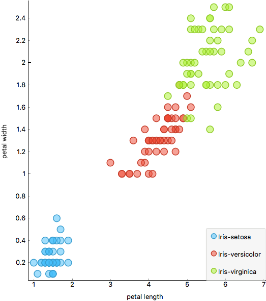
We’d say it is the right one. Why? Because now we know that the combination of petal length and petal width nicely separates the classes!
Of course, Informative Projections button will only work when you have set a class (target) variable.
In scatter plot, you can set also the color of the data points (class is selected by default), the size of the points and the shape. This means you can add three new layers of information to your data, but we warn you not to overuse them. This usually looks very incomprehensible, even though it packs a lot of information.
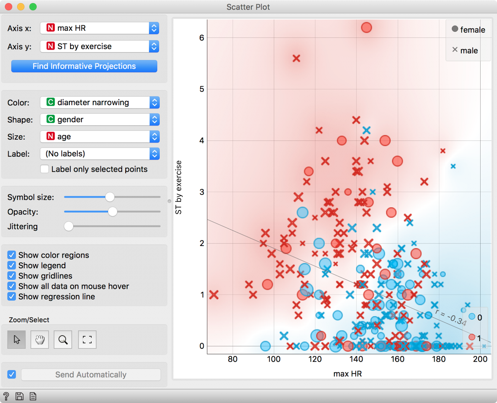
You might notice, that in the current version of Orange, you can no longer select discrete attributes in Scatter Plot. This is entirely intentional. Scatter plots are best at showing the relationship between two numeric variables, such as in the two examples above. Categorical variables are much better represented with Box Plots, histograms (in Distributions) or in Mosaic Display.
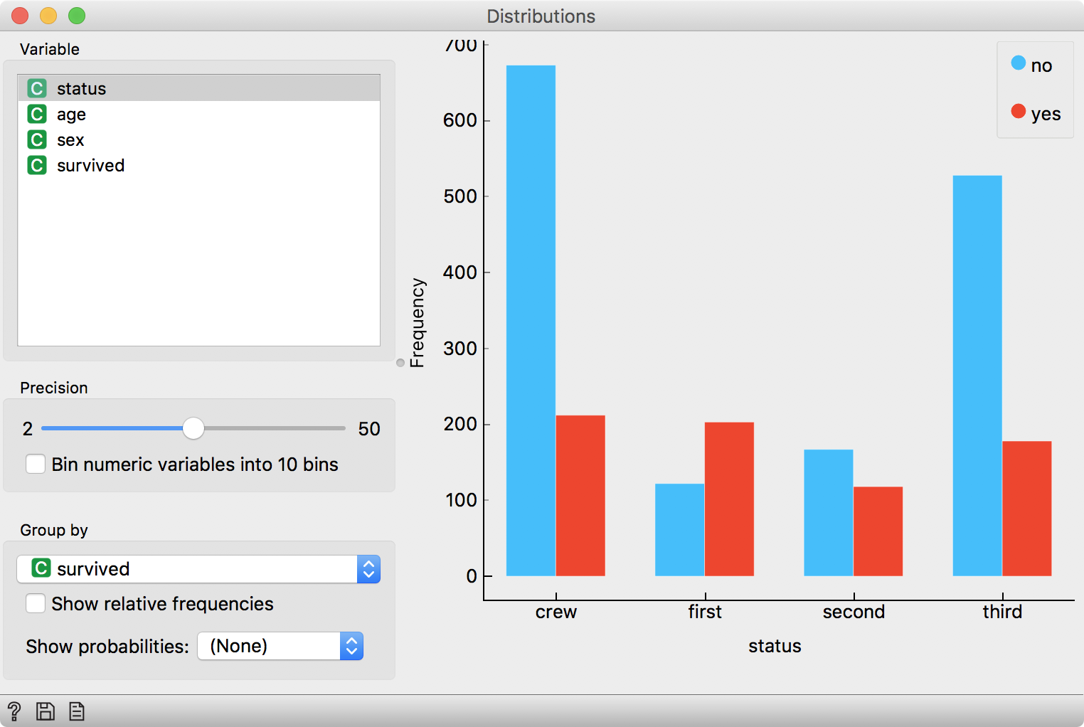
Above, we have presented the same information for titanic data set in different visualizations, that are particularly suitable for categorical variables.
Scatter plot also enables so cool tricks. Just like in most visualizations in Orange, I can select a part of the data and observe the subset downstream. Or the other way around. I have a particular subset I wish to observe and I can pass it to Scatter Plot widget, which will highlight selected data instances.
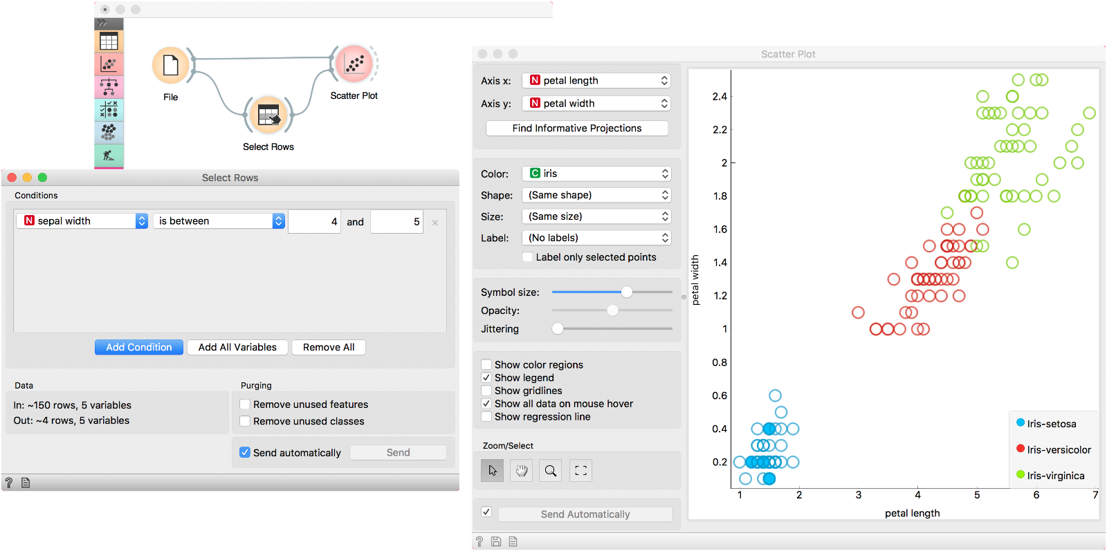
This is also true for all other point-based visualizations in Orange, namely t-SNE, MDS, Radviz, Freeviz, and Linear Projection.
You can see there are many great thing you can do with Scatter Plot. Finally, we have added a nice touch to the visualization.
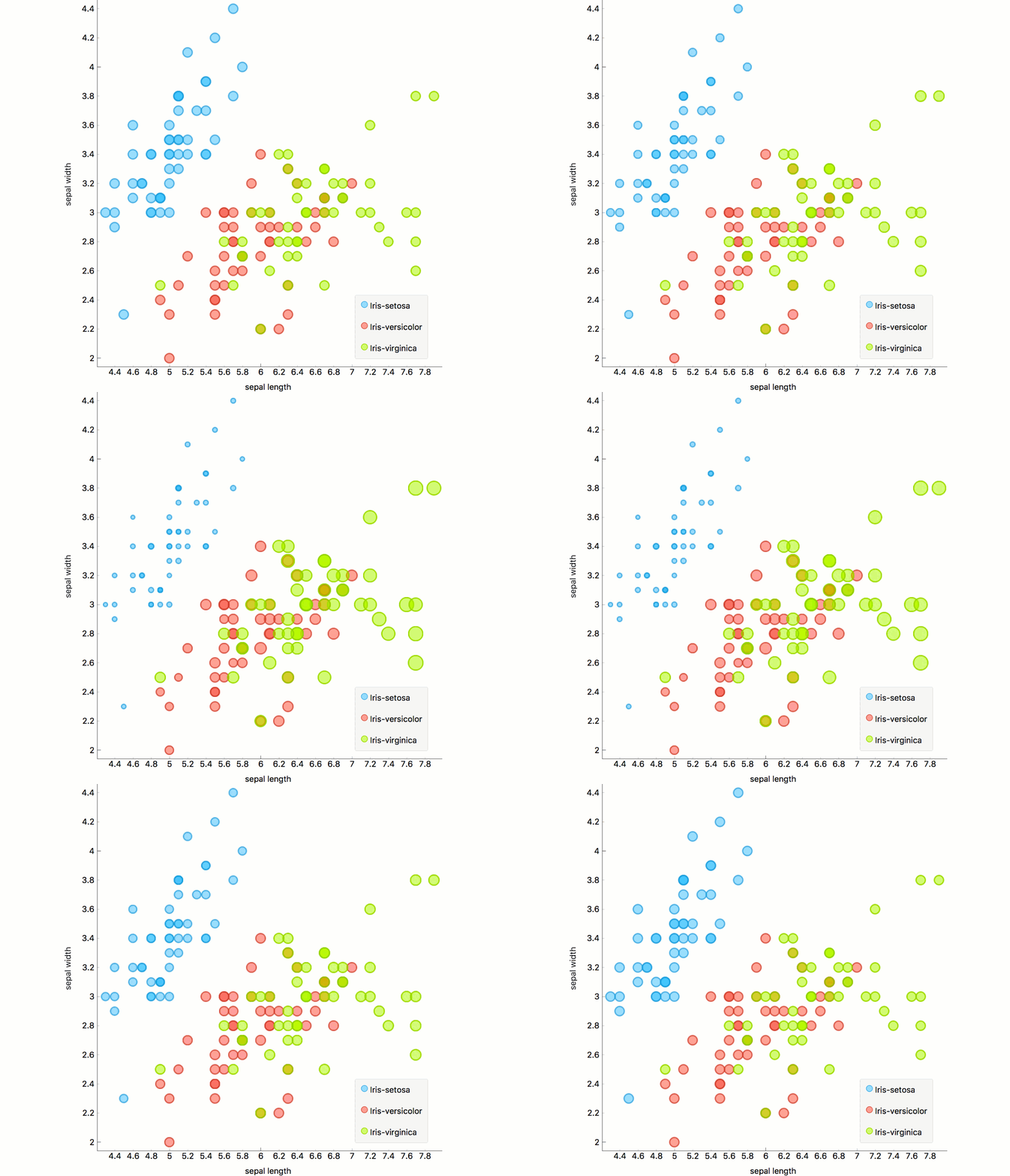
Yes, setting the size of the attribute is now animated! 🙂
Happy holidays, everyone!
