This week we held our first Girls Go Data Mining workshop. The workshop brought together curious women and intuitively introduced them to essential data mining and machine learning concepts. Of course, we used Orange to explore visualizations, build predictive models, perform clustering and dive into text analysis. The workshop was supported by NumFocus through their small development grant initiative and we hope to repeat it next year with even more ladies attending!
Related: Text Analysis for Social Scientists
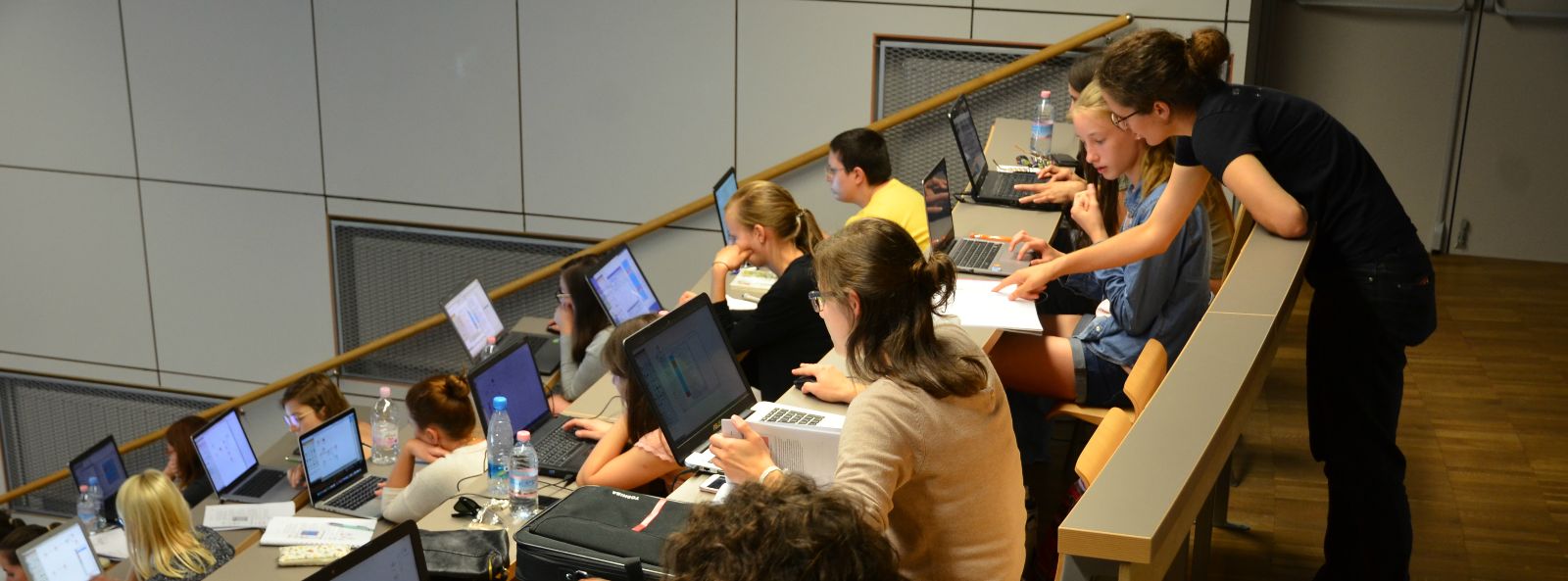
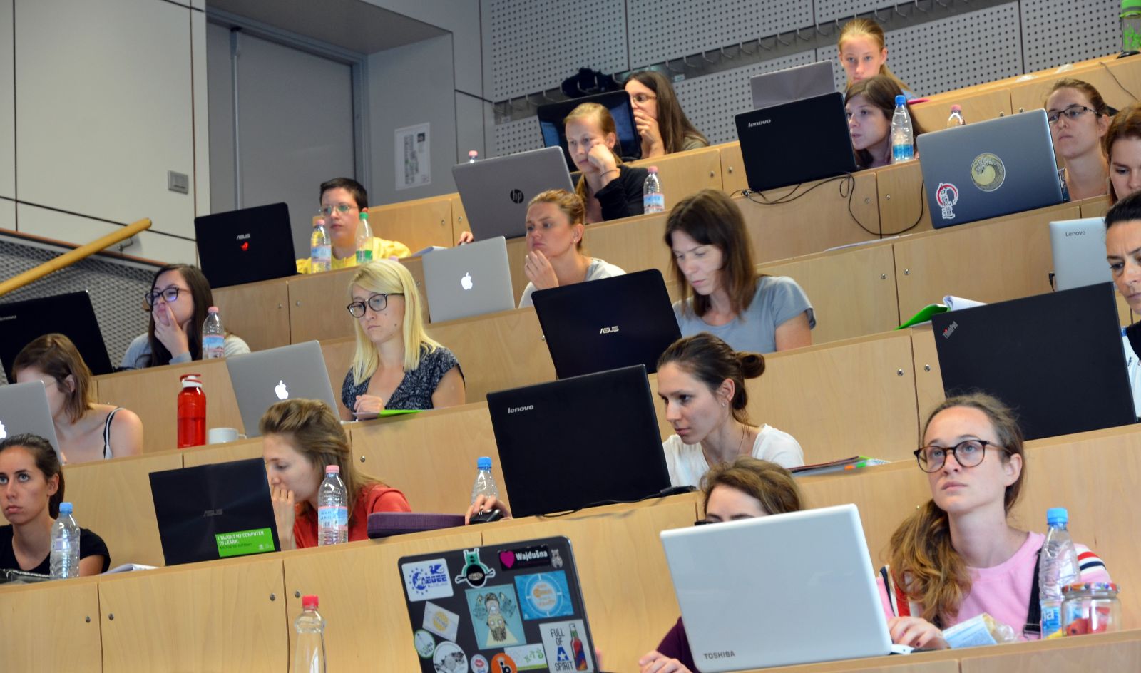
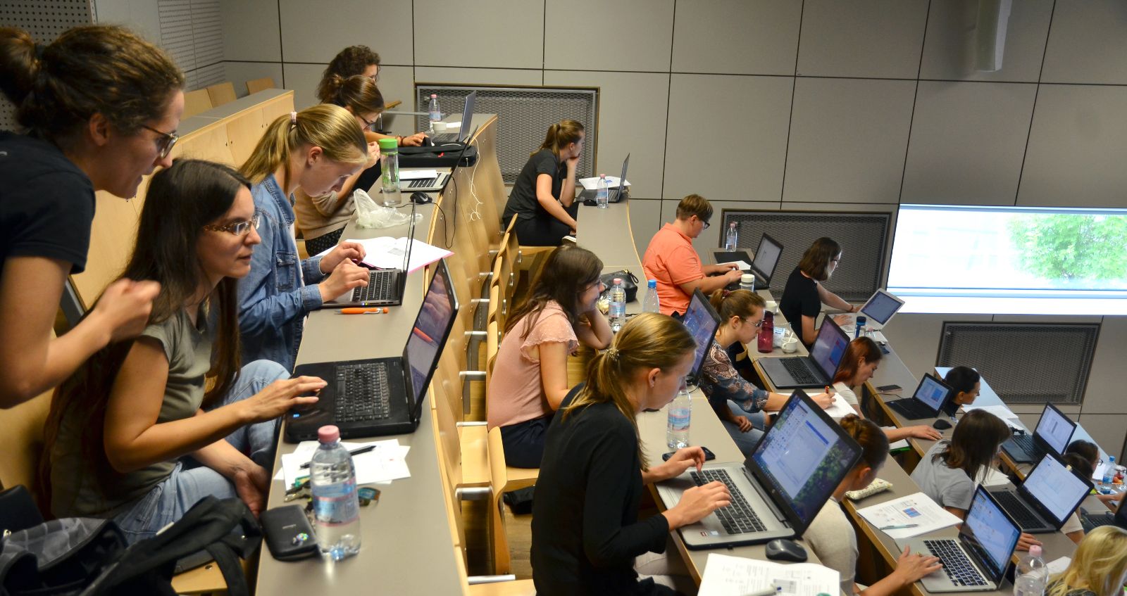
In two days, we covered many topics. On day one, we got to know Orange and the concept of visual programming, where the user construct analytical workflow by stacking visual components. Then we got to know several useful visualizations, such as box plot, scatter plot, distributions, and mosaic display, which give us an initial overview of the data and the potentially interesting patterns. Finally, we got our hands dirty with predictive modeling. We learnt about decision trees, logistic regression, and naive Bayes classifiers, and observed the models in tree viewer and nomogram. It is great having interpretable models and we had great fun exploring what is in the model!
On the second day, we tried to uncover groups in our data with clustering. First, we tried hierarchical clustering and explored the discovered clusters with box plot. Then we also tried k-means and learnt, why this method is better than hierarchical clustering. In the final part, we talked about the methods for text mining, how to do preprocessing, construct a bag of words and perform the machine learning on corpora. We used both clustering and classification and tried to find interesting information about Grimm tales.
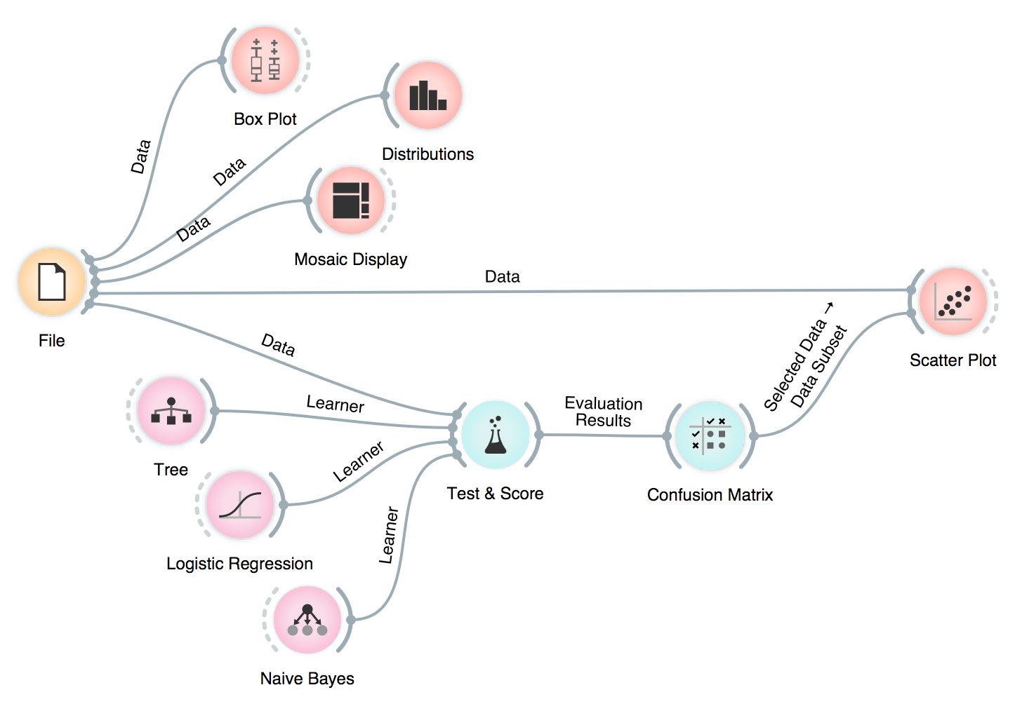
One of our workflows, where we explored the data in many different ways, including inspecting misclassifications in a scatter plot!
One thing that always comes up as really useful in our workshops is Orange’s ability to output different types of data. For example, in Hierarchical Clustering, we can select the similarity cutoff at the top and output clusters. Our data table will have an additional column Cluster, with cluster labels for each data instance.
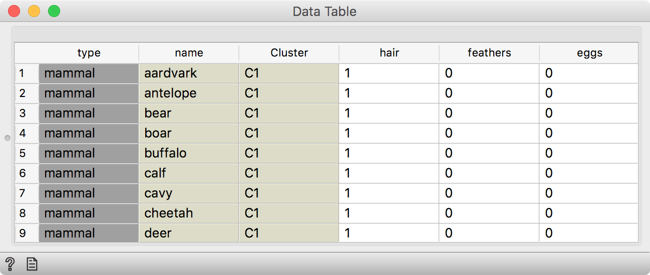
Hierarchial Clustering outputs data with an additional Cluster column.

We can explore clusters by connecting a Box Plot to Hierarchical Clustering, selecting Cluster in Subgroups and using Order by relevance option. This sorts the variables in Box Plot by how well they separate between clusters or, in other words, what is typical of each cluster.
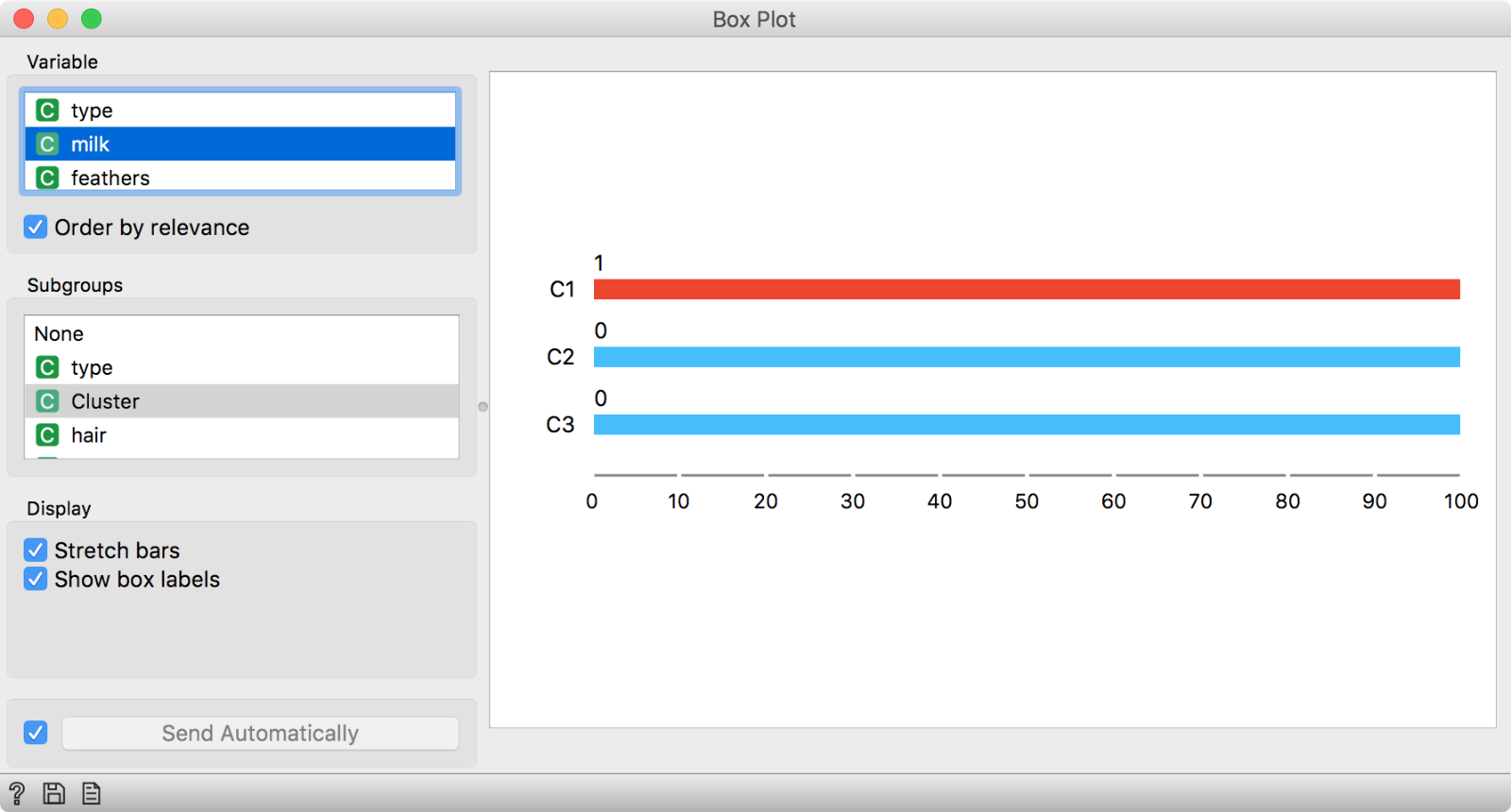 We have selected Cluster in Subgroups section and ticked ‘Order by relevance’ to sort the variables. Variables at the top are the most interesting ones. Looks like giving milk is an exclusive property of cluster C1.
We used zoo.tab and made the cutoff at three clusters. It looks like the first cluster gives milk. Could these be a cluster of mammals?
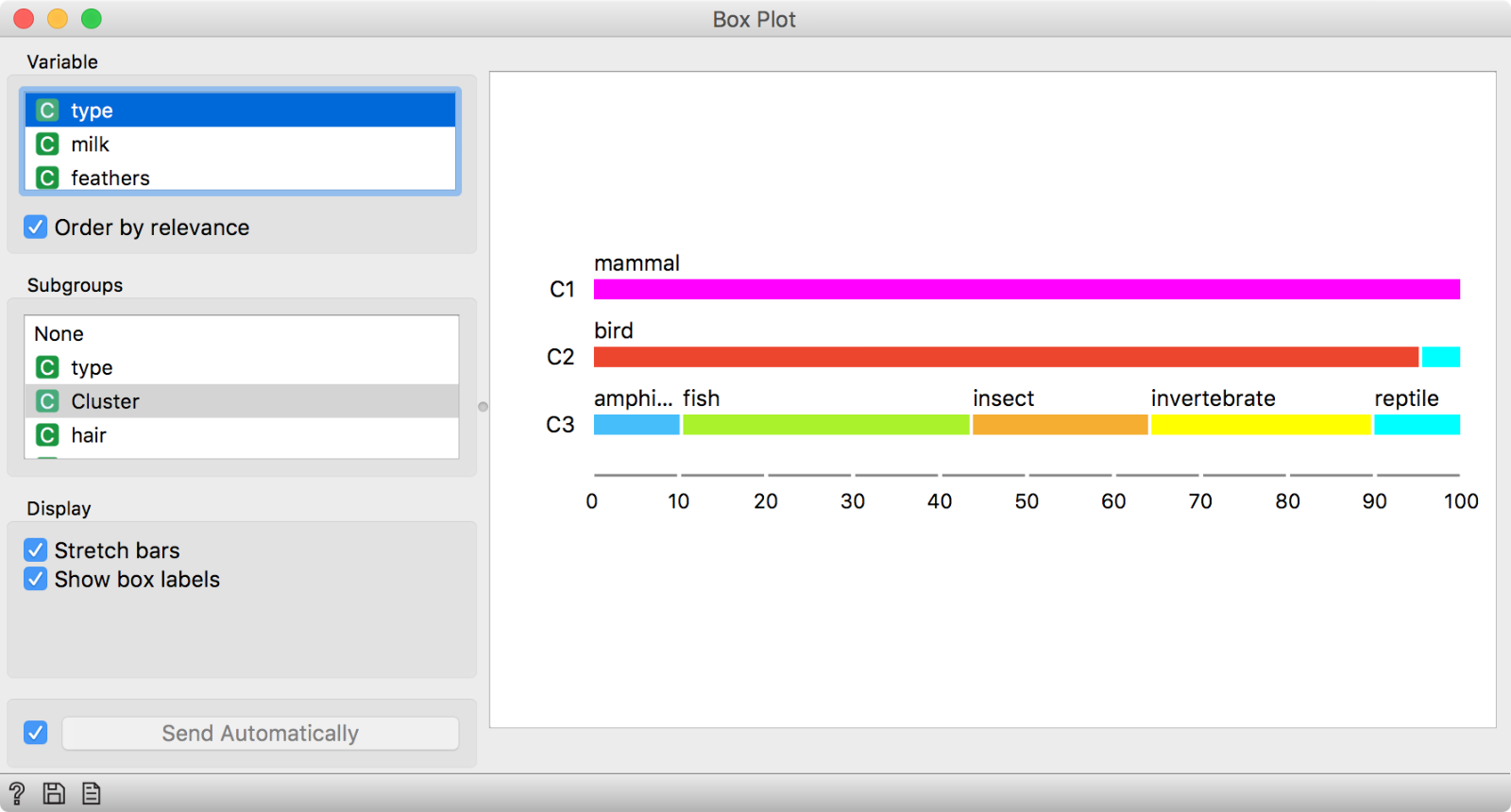
We said giving milk is a property of cluster C1. By selecting type as our variable, we can see that C1 is a cluster of mammals.
Indeed it is!
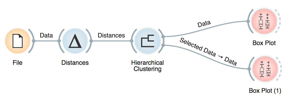
Another option is to select a specific cluster in the dendrogram. Then, we have to rewire the connection between Hierarchical Clustering and Box Plot by setting it to Data. Data option will output the entire data set, with an extra column showing whether the data instance was selected or not. In our case, there would be a Yes if the instance is in the selected cluster and No if it is not.
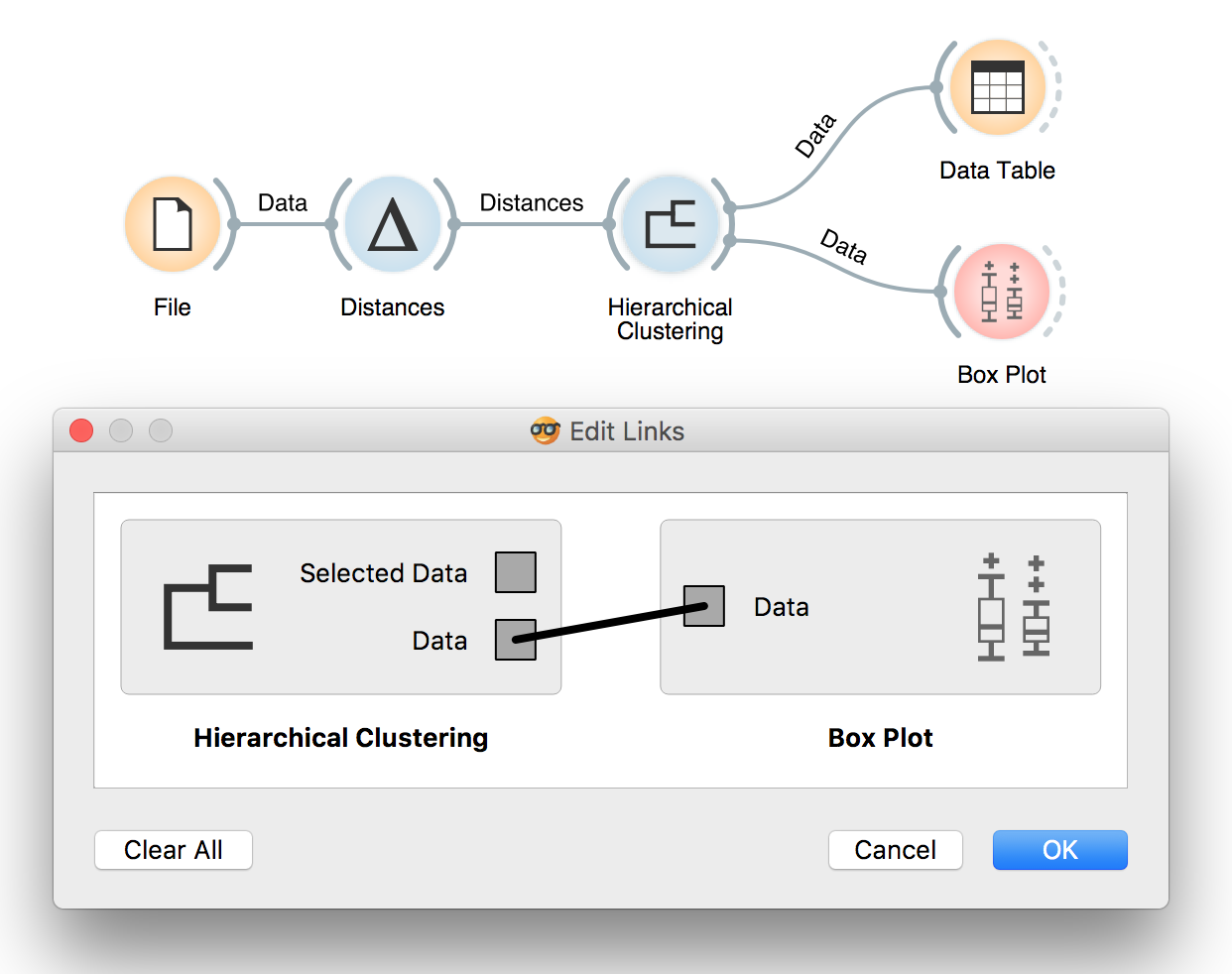 To rewire the connection, double-click on it and drag a line from Data to Data.
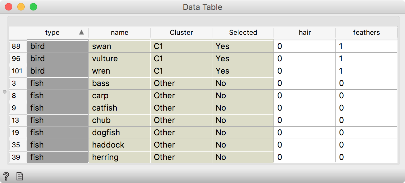 We have selected one cluster in the dendrogram, rewired the connection to transmit Data (instead of Selected Data) and observed the results in a Data Table. We see an additional Selected column, which shows whether a data instance was selected in the visualization or not.
Then we can use Box Plot to observe what is particular for our selected cluster.
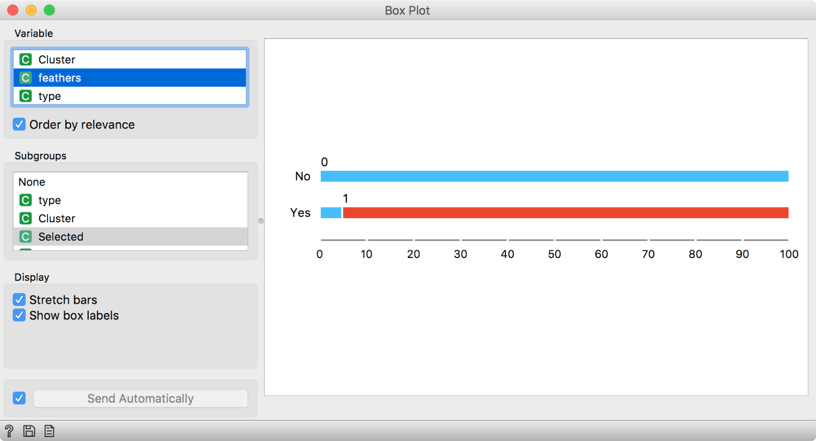
In this Box Plot we have used Selected in the Subgroups section and kept ‘Order by relevance’ on. The suggested distinctive feature of our selected cluster is having feathers.
It looks like animals from our selected cluster have feathers. Probably, this is a cluster of birds. We can check this with the same procedure as above.
In summary, most Orange visualizations have two outputs - Selected Data and Data. Selected Data will output a subset of data instances selected in the visualization (or selected clusters in the case of hierarchical clustering), while Data will output the entire data table with a column defining whether a data instance was selected or not. This is very useful if we want to inspect what is typical of an interesting group in our data, inspect clusters or even manually define groups.
Overall, this was another interesting workshop and we hope to continue our fruitful partnership with NumFocus and keep offering free educational events for beginners and experts alike!
