Scatter plots are great! But sometimes, we need to plot more than two variables to truly understand the data. How can we achieve this, knowing humans can only grasp up to three dimensions? With an optimization of linear projection, of course!
Orange recently re-introduced FreeViz, an interactive visualization for plotting multiple variables on a 2-D plane.
Let’s load zoo.tab data with File widget and connect FreeViz to it. Zoo data has 16 features describing animals of different types - mammals, amphibians, insects and so on. We would like to use FreeViz to show us informative features and create a visualization that separates well between animal types.
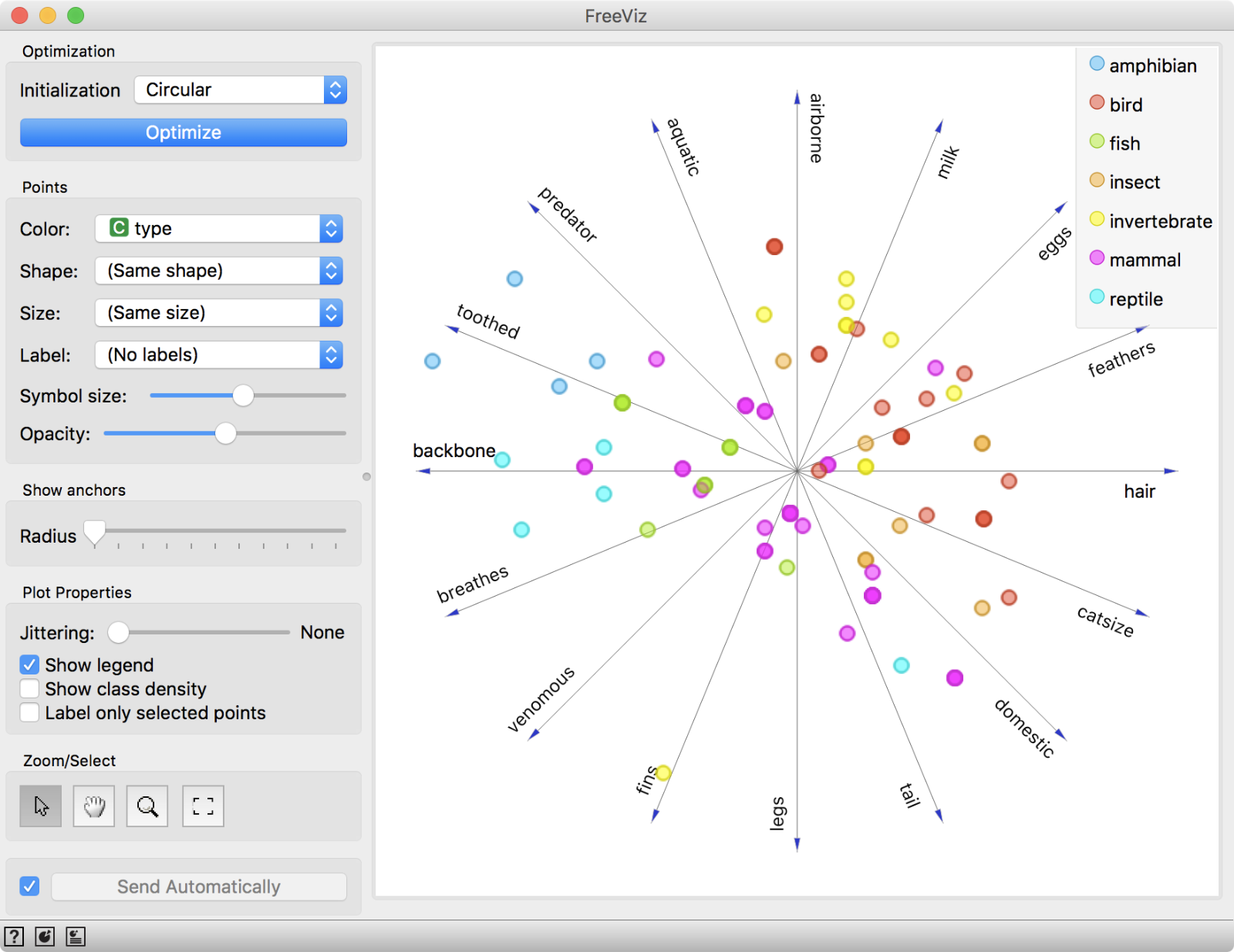 FreeViz with initial, un-optimized plot.
We start with un-optimized projection, where data points are scattered around features axes. Once we click Optimize, we can observe optimization process in real-time and at the end see the optimized projection.
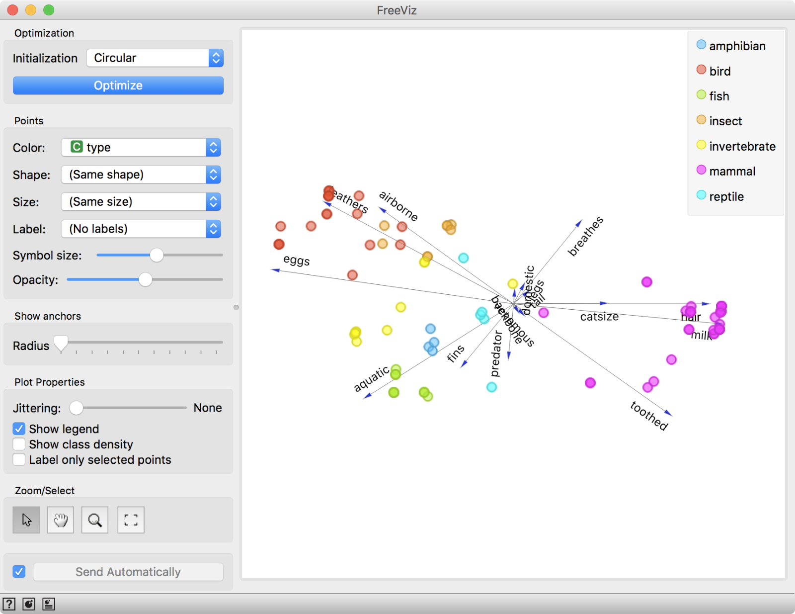
FreeViz with optimized projection.
This projection is much more informative. Mammals are nicely grouped together within a pink cluster that is characterized by hair, milk, and toothed features. Conversely, birds are charaterized by eggs, feathers and airborne, while fish are aquatic. Results are as expected, which means optimization indeed found informative features for each class value.
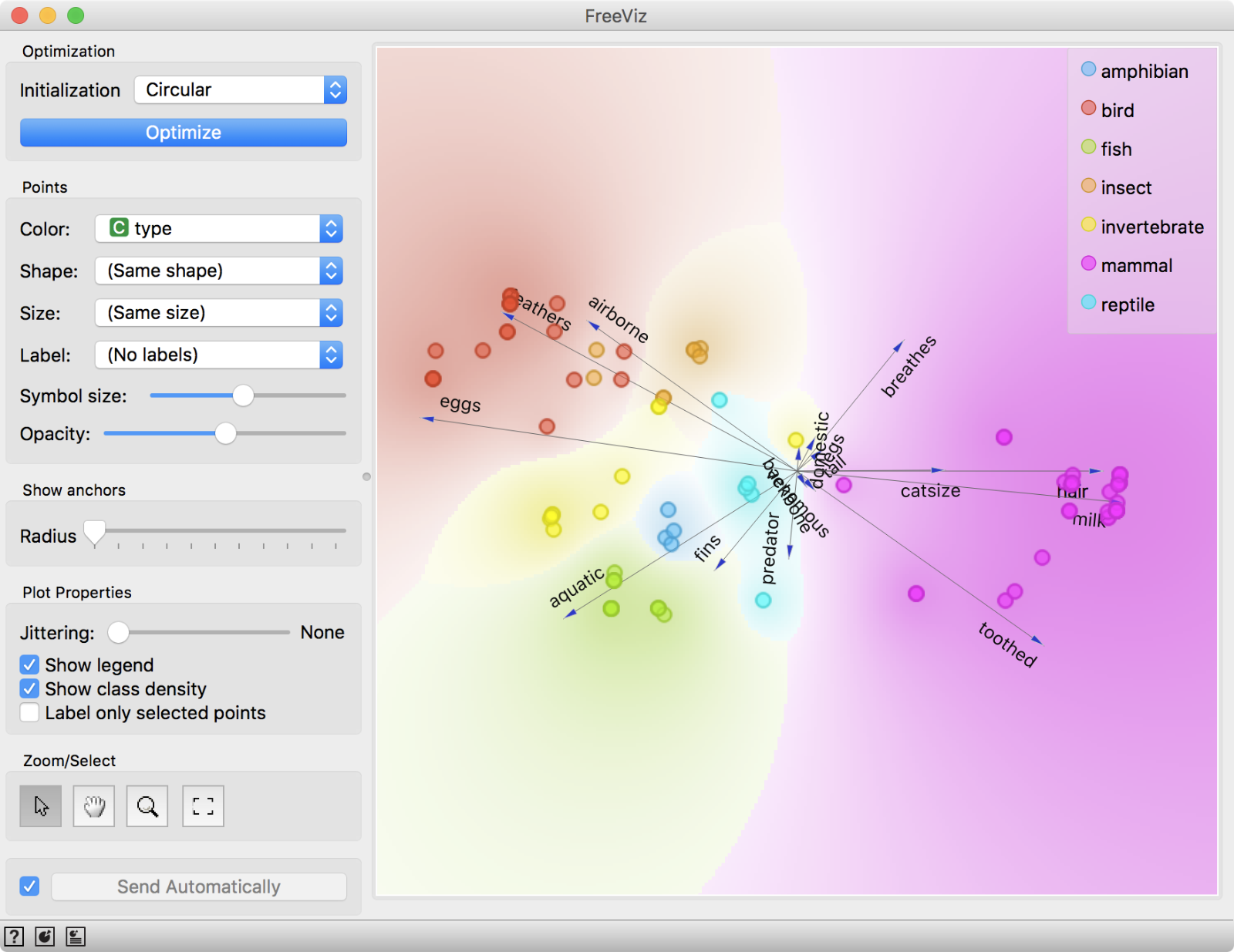
FreeViz with Show class density option.
Since we are working with categorical class values, we can tick Show class density to color the plot by majority class values. We can also move anchors around to see how data points change in relation to a selected anchor.

Finally, as in most Orange visualizations, we can select a subset of data points and explore them further. For example, let us observe which amphibians are characterized by being aquatic in a Data Table. A newt, a toad and two types of frogs, one venomous and one not.
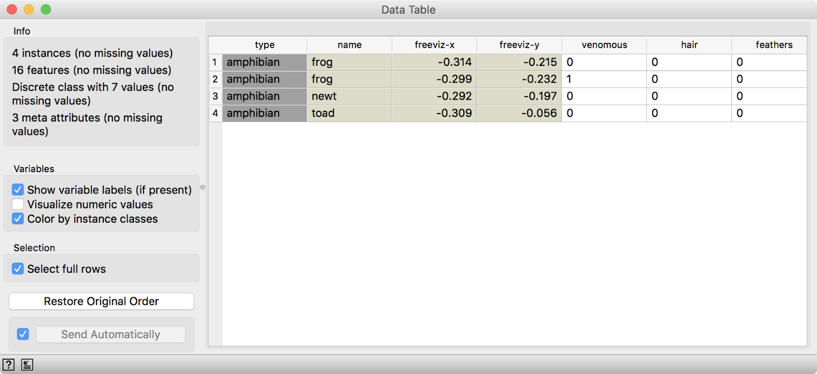
Data exploration is always much easier with clever visualizations!
