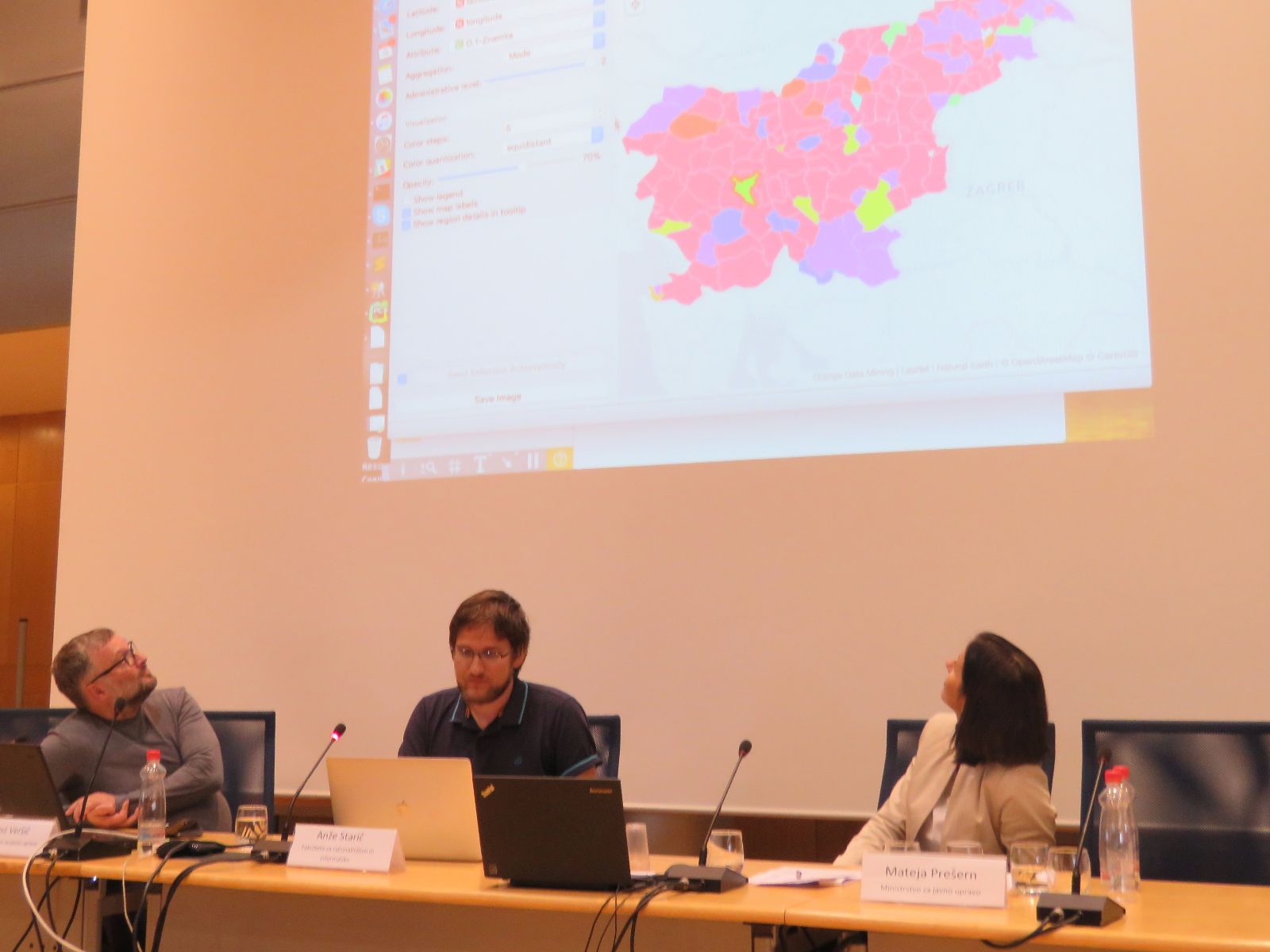
Last week, we presented Orange at the Festival of Open Data, a mini-conference organized by the Slovenian government, dedicated to the promotion of transparent access to government data. In a 10 minute presentation, we showed how Orange can be used to visualize and explore what kinds of vehicles were registered for the first time in Slovenia in 2017.
The original dataset is available at the OPSI portal and it consists of 73 files, one for each month since January 2012. For the presentation, we focused on the 2017 data. If you want to follow along, you can download the merged dataset (first 9 months of 2017 as a single file). The workflow I used to prepare the data is also available.
When exploring the data, the first thing we do is take a look at distributions. If we observe the distribution of new and used cars bought by the gender of the buyer, we can see that men prefer used cars while women more often opt for a new car. Or we can observe the distribution by age to see that older people tend to buy newer cars.
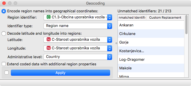
But the true power of Orange can be seen if we visualize the data on a map. In order to do this, we need to first use Geocoding to map municipality names to regions which can be shown on a map by choosing the column that contains municipality name (C1.3-Obcina uporabnika) and clicking apply. Since municipalities in Slovenia are created all the time, not all of them can be matched. The right part of the widget allows us to map these small municipalities to the nearest region. Or we can just ignore them.
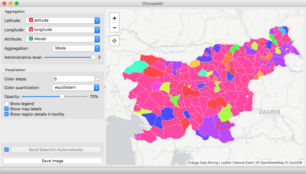
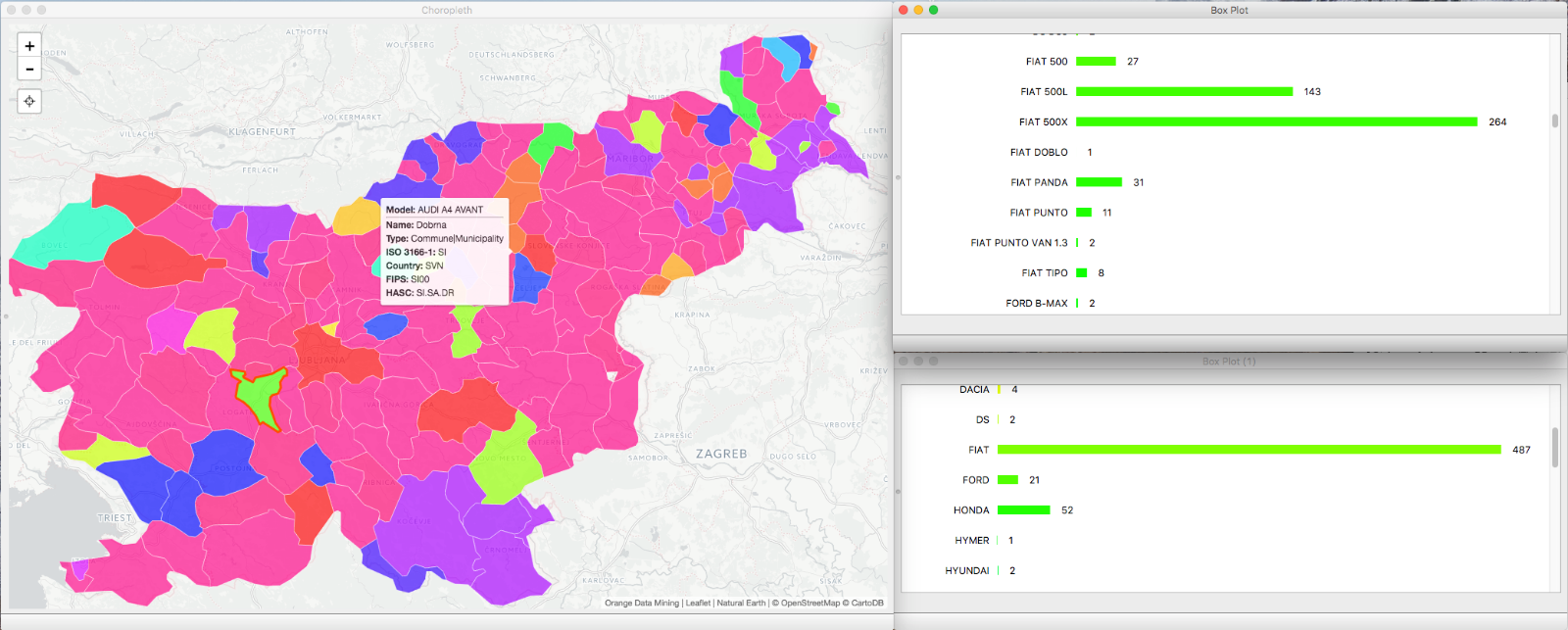
The geocoded data can be displayed with Choropleth. If we select attribute D.1-Znamka and aggregation by mode, we get a visualization showing the most frequently bought mode for each region. Care to guess which manufacturer corresponds to the pink(-ish) color? It’s Volkswagen, in some regions with Golf and in other regions with Passat. But the visualization gives us just the most frequent value for each municipality. What if we would like to know more? As is the case with all visualizations you can click on a specific region on a map to select it and get the corresponding data on the output. We can then use Purge Domain to ignore the models that were not sold in the selected region and Box Plot to visualize the distribution by the model or by the manufacturer.
In Box Plot, select D.1 Znamka as both the variable and Subgroup and you get an overview of the distribution of cars by manufacturers in the selected region. But that is just the first step. We can also take a look at the distribution of Fiat cars by adding another boxplot. Now you can select the manufacturer and get a detailed distribution of specific car models sold. If you take some care in positioning the windows, you can create an interactive explorer, where you click on regions and instantly see the detailed distributions in the connected boxplots.
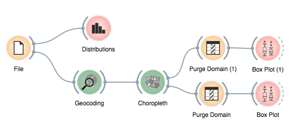
The final workflow should look like this:
