This is a guest blog from the Google Summer of Code project.
As a part of my Google Summer of Code project I started developing educational widgets and assemble them in an Educational Add-On for Orange. Educational widgets can be used by students to understand how some key data mining algorithms work and by teachers to demonstrate the working of these algorithms.
Here I describe an educational widget for interactive k-means clustering, an algorithm that splits the data into clusters by finding cluster centroids such that the distance between data points and their corresponding centroid is minimized. Number of clusters in k-means algorithm is denoted with k and has to be specified manually.
The algorithm starts by randomly positioning the centroids in the data space, and then improving their position by repetition of the following two steps:
- Assign each point to the closest centroid.
- Move centroids to the mean position of points assigned to the centroid.
The widget needs the data that can come from File widget, and outputs the information on clusters (Annotated Data) and centroids:

Educational widget for k-means works finds clusters based on two continuous features only, all other features are ignored. The screenshot shows plot of an Iris data set and clustering with k=3. That is partially cheating, because we know that iris data set has three classes, so that we can check if clusters correspond well to original classes:
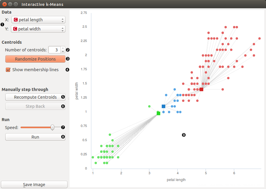
- Select two features that are used in k-means
- Set number of centroids
- Randomize positions of centroids
- Show lines between centroids and corresponding points
- Perform the algorithm step by step. Reassign membership connects points to nearest centroid, Recompute centroids moves centroids.
- Step back in the algorithm
- Set speed of automatic stepping
- Perform the whole algorithm as fast preview
- Anytime we can change number of centroids with spinner or with click in desired position in the graph.
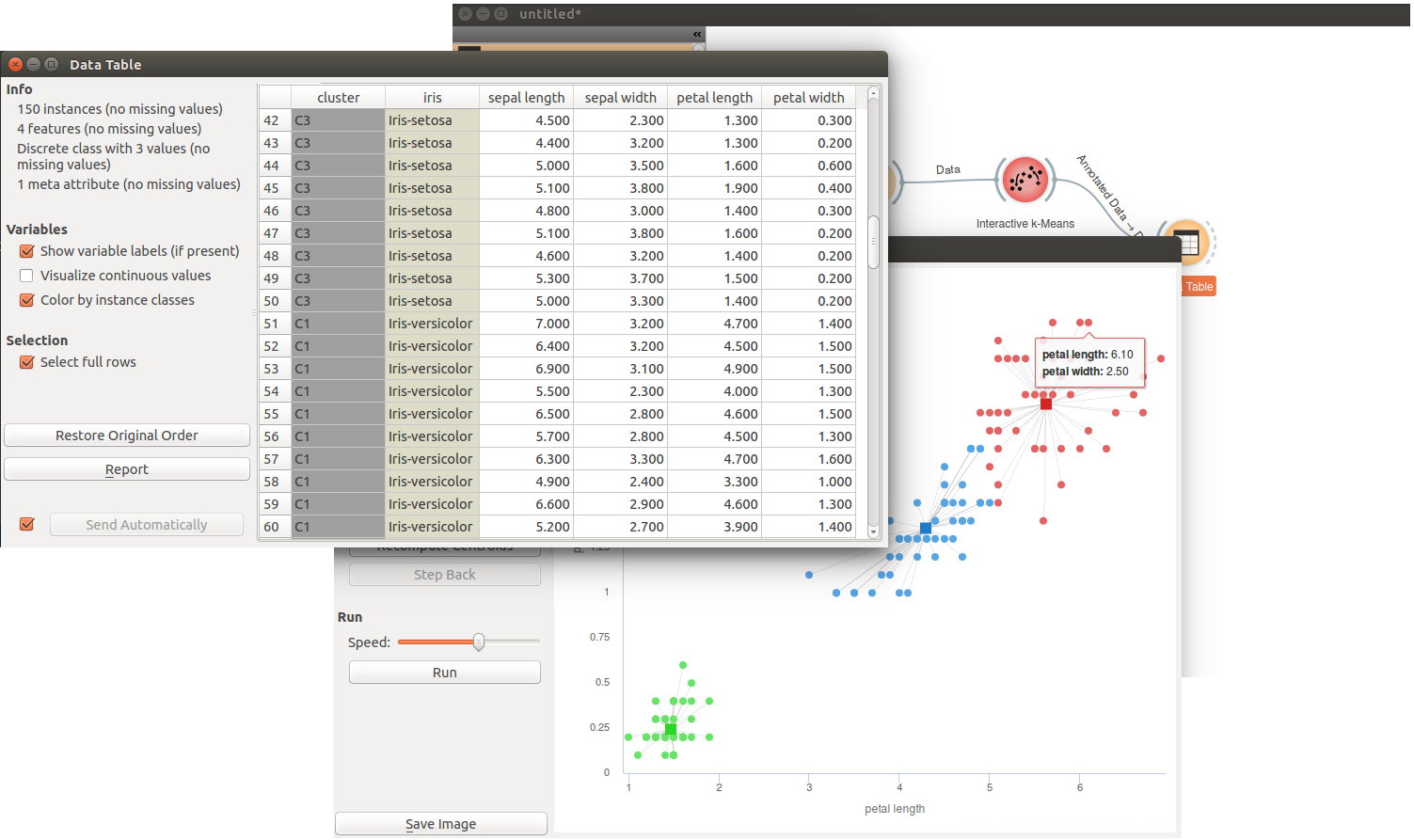
If we want to see the correspondence of clusters that are denoted by k-means and classes, we can open Data Table widget where we see that all Iris-setosas are clustered in one cluster and but there are just few Iris-versicolor that are classified is same cluster together with Iris-virginica and vice versa.
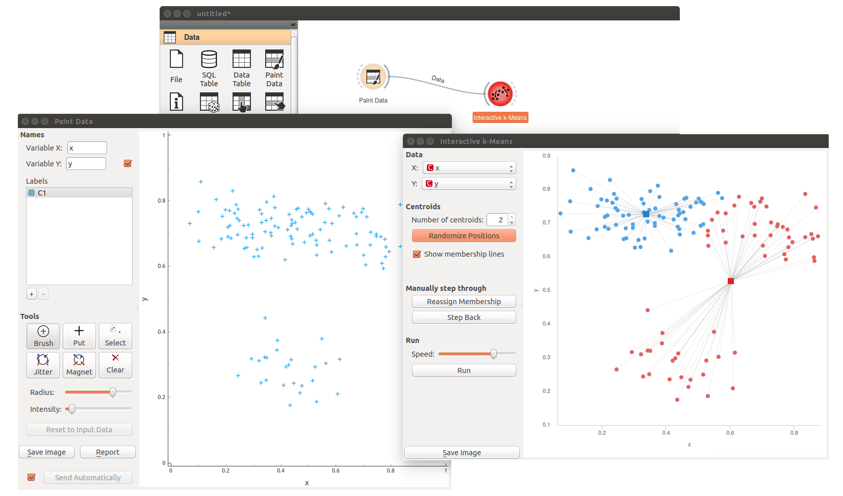
Interactive k-means works great in combination with Paint Data. There, we can design data sets where k-mains fails, and observe why.
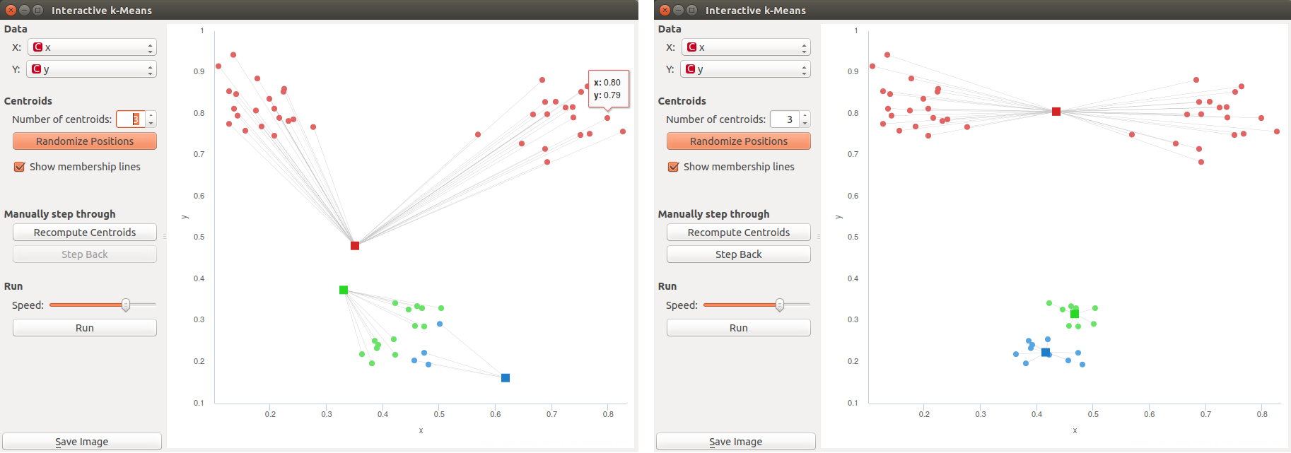
We could also design data sets where k-means fails under specific initialization of centroids. Ah, I did not tell you that you can freely move the centroids and then restart the algorithm. Below we show the case of centroid initialization and how this leads to non-optimal clustering.
