Visualizing relations between data instances can tell us a lot about our data. Let’s see how this works in Orange. We have a data set on machine learning and data mining conferences and journals, with the number of shared authors for each publication venue reported. We can estimate similarity between two conferences using the author profile of a conference: two conference would be similar if they attract the same authors. The data set is already 9 years old, but obviously, it’s about the principle. :) We’ve got two data files: one is a distance file with distance scores already calculated by Jaccard index and the other is a standard conferences.tab file.
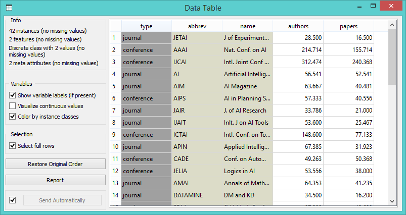 Conferences.tab data file with the type of the publication venue (conference or journal) and average number of authors and published papers.
We load .tab file with the File widget (data set already comes with Orange) and .dst file with the Distance File widget (select ‘Browse documentation data sets’ and choose conferences.dst).
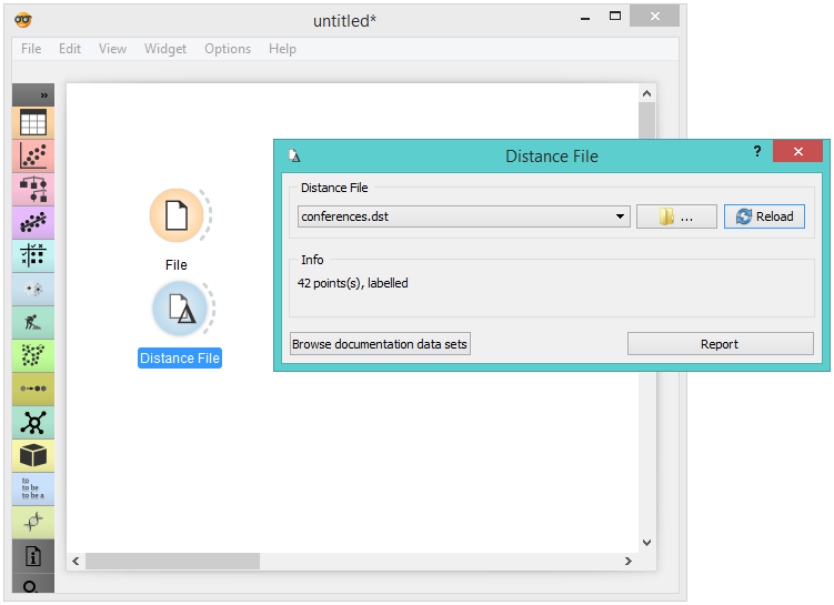
You can find conferences.dst in ‘Browse documentation data sets’.
Now we would like to create a graph from the distance file. Connect Distance File to Network from Distances. In the widget, we’ve selected a high distance threshold, because we would like to get more connections between nodes. We’ve also checked ‘Include also closest neighbors’ to see each node connected with at least one other node.
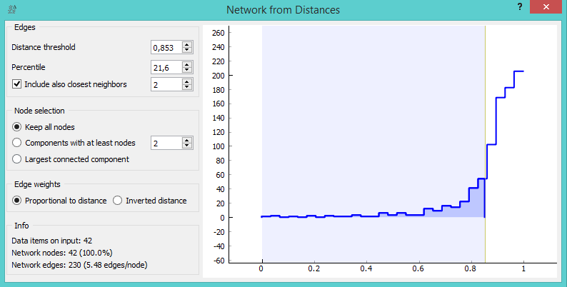
We’ve set a high distance threshold, since we wanted to display connections between most of our nodes.
We can visualize our graph in Network Explorer. What we get is a quite uninformative network of conferences with labelled nodes. Now for the fun part. Connect the File widget with Network Explorer and set the link type to ‘Node Data’. This will match the two domains and display additional labelling options in Network Explorer.
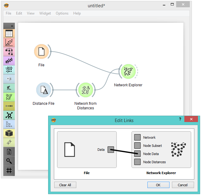
Remove the ‘Node Subset’ link and connect Data to Node Data. This will display other attributes in Network Explorer by which you can label and color your network nodes.
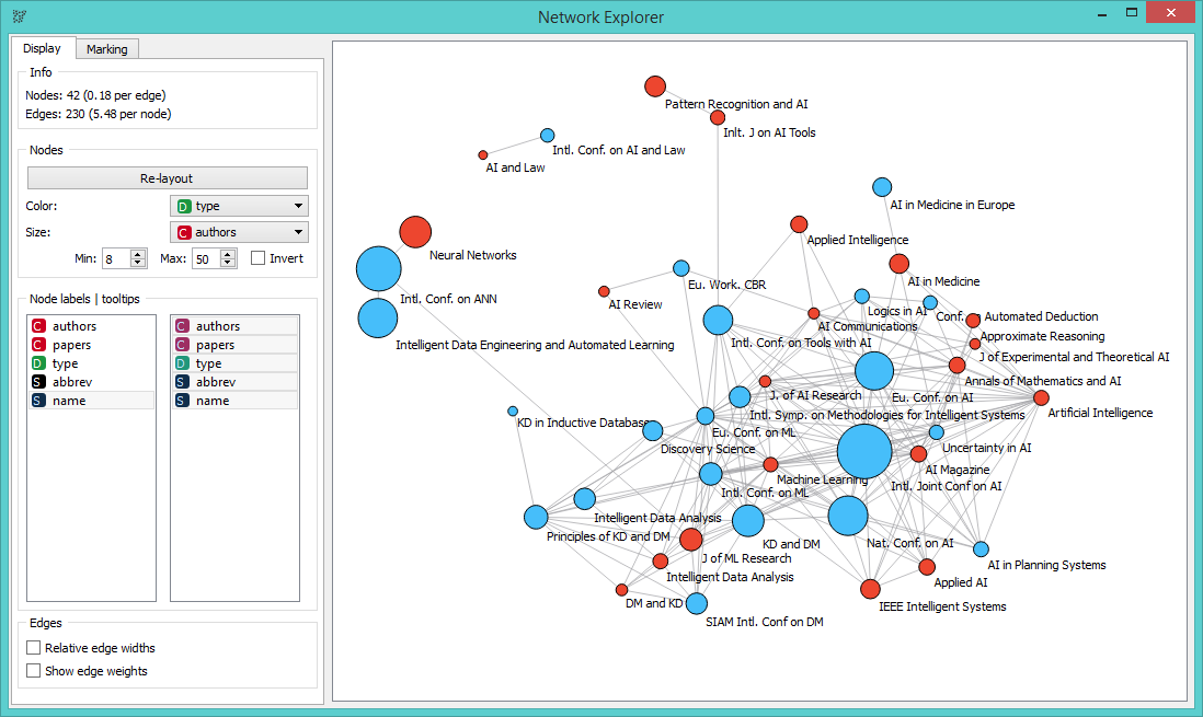
Nodes are colored by event type (conference or journal) and adjusted in size by the average number of authors per event (bigger nodes represent larger events).
We’ve colored the nodes by type and set the size of the nodes to the number of authors per conference/paper. Finally, we’ve set the node label to ’name’. Seems like International Conference on AI and Law and AI and Law journal are connected through the number of shared authors. Same goes for AI in Medicine in Europe conference and AI and Medicine journal. Connections indeed make sense.
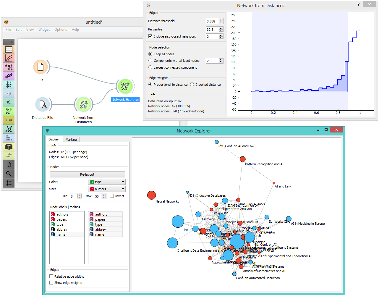
The entire workflow.
There are many other things you can do with the Networks add-on in Orange. You can color nodes by predictions, highlight misclassifications or output only nodes with certain network parameters. But for today, let this be it.
