One of the cool things about being a data scientist is being able to predict. That is, predict before we know the actual outcome. I am not talking about verifying your favorite classification algorithm here, and I am not talking about cross-validation or classification accuracies or AUC or anything like that. I am talking about the good old prediction. This is where our very own Predictions widget comes to help.
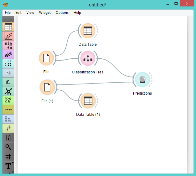
 Predictions workflow.
We will be exploring the Iris data set again, but we’re going to add a little twist to it. Since we’ve worked so much with it already, I’m sure you know all about this data. But now we got three new flowers in the office and of course there’s no label attached to tell us what species of Iris these flowers are. [sigh….] Obviously, we will be measuring petals and sepals and contrasting the results with our data.
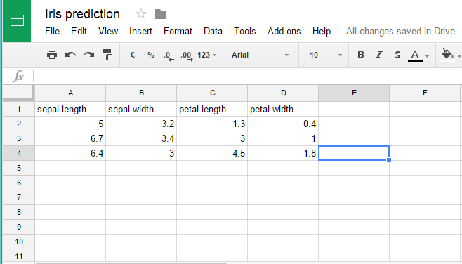
 Our new data on three flowers. We have used Google Sheets to enter the data and the copied the sharable link and pasted the link to the File widget.
But surely you don’t want to go through all 150 flowers to properly match the three new Irises? So instead, let’s first train a model on the existing data set. We connect the File widget to the chosen classifier (we went with Classification Tree this time) and feed the results into Predictions. Now we write down the measurements for our new flowers into Google Sheets (just like above), load it into Orange with a new File widget and input the fresh data into Predictions. We can observe the predicted class directly in the widget itself.
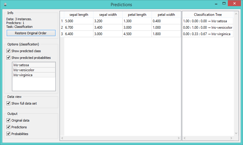
 Predictions made by classification tree.
In the left part of the visualization we have the input data set (our measurements) and in the right part the predictions made with classification tree. By default you see probabilities for all three class values and the predicted class. You can of course use other classifiers as well - it would probably make sense to first evaluate classifiers on the existing data set, find the best one for your and then use it on the new data.
