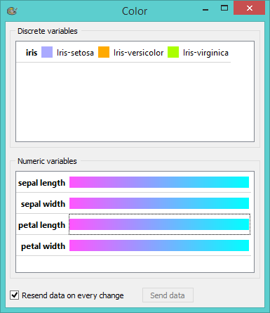
Holiday season is upon us and even the Orange team is in a festive mood. This is why we made a Color widget!

This fascinating artsy widget will allow you to play with your data set in a new and exciting way. No more dull visualizations and default color schemes! Set your own colors the way YOU want it to! Care for some magical cyan-to-magenta? Or do you prefer a more festive red-to-green? How about several shades of gray? Color widget is your go-to stop for all things color (did you notice it’s our only widget with a colorful icon?). :)
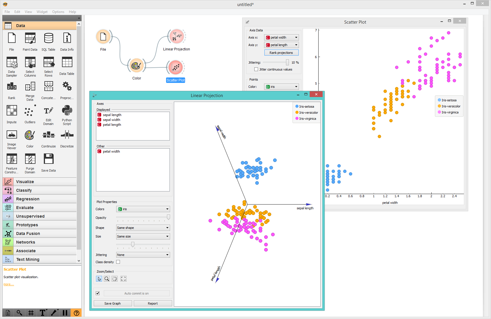
Coloring works with most visualization widgets, such as scatter plot, distributions, box plot, mosaic display and linear projection. Set the colors for discrete values and gradients for continuous values in this widget, and the same palletes will be used in all downstream widgets. As a bonus, the Color widget also allows you to edit the names of variables and values.

Remember - the (blue) sky is the limit.
