Recently we’ve made a short survey that was, upon Orange download, asking people how they found out about Orange, what was their data mining level and where do they work. The main purpose of this is to get a better insight into our user base and to figure out what is the profile of people interested in trying Orange.
Here we have some preliminary results that we’ve managed to gather in the past three weeks or so. Obviously we will use Orange to help us make sense of the data.
We’ve downloaded our data from Typeform and appended some background information such as OS and browser. Let’s see what we’ve got in the Data Table widget.
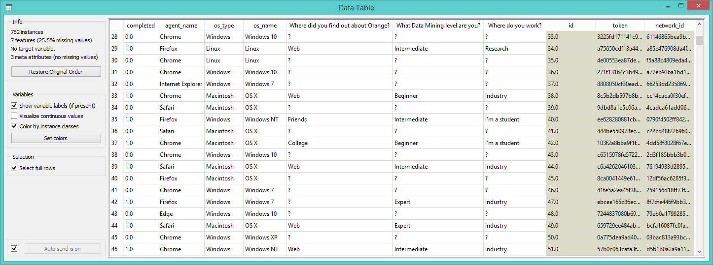
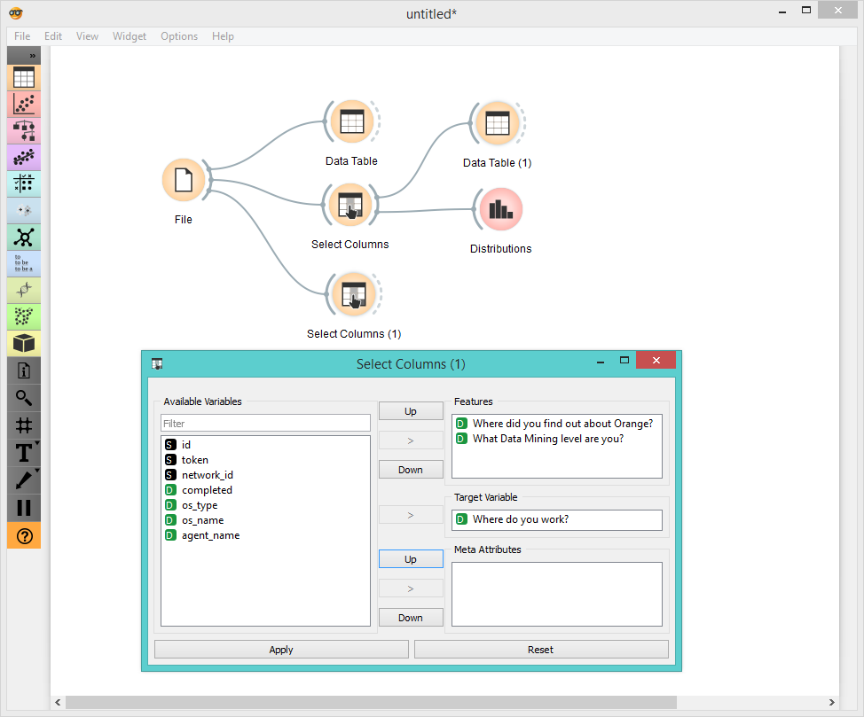
Ok, this is our entire data table. Here we also have the data on people who completed the survey and who didn’t. First, let’s organize the data properly. We’ll do this with Select Columns widget.
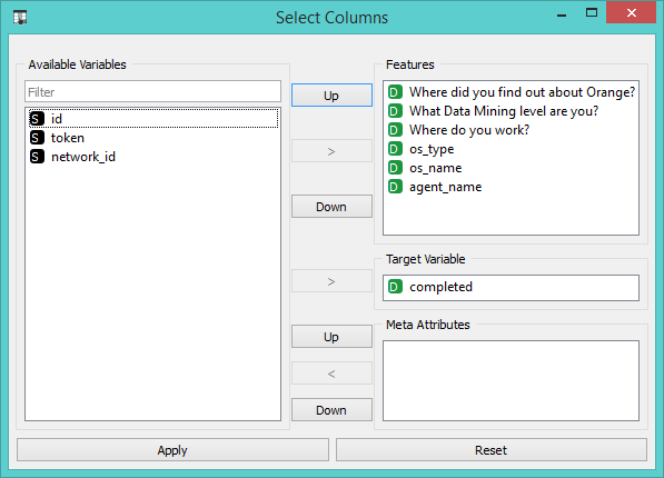
We removed all the meta attributes as they are not very relevant for our analysis. Next we moved the ‘completed’ attribute into target variable, thus making it our class variable.
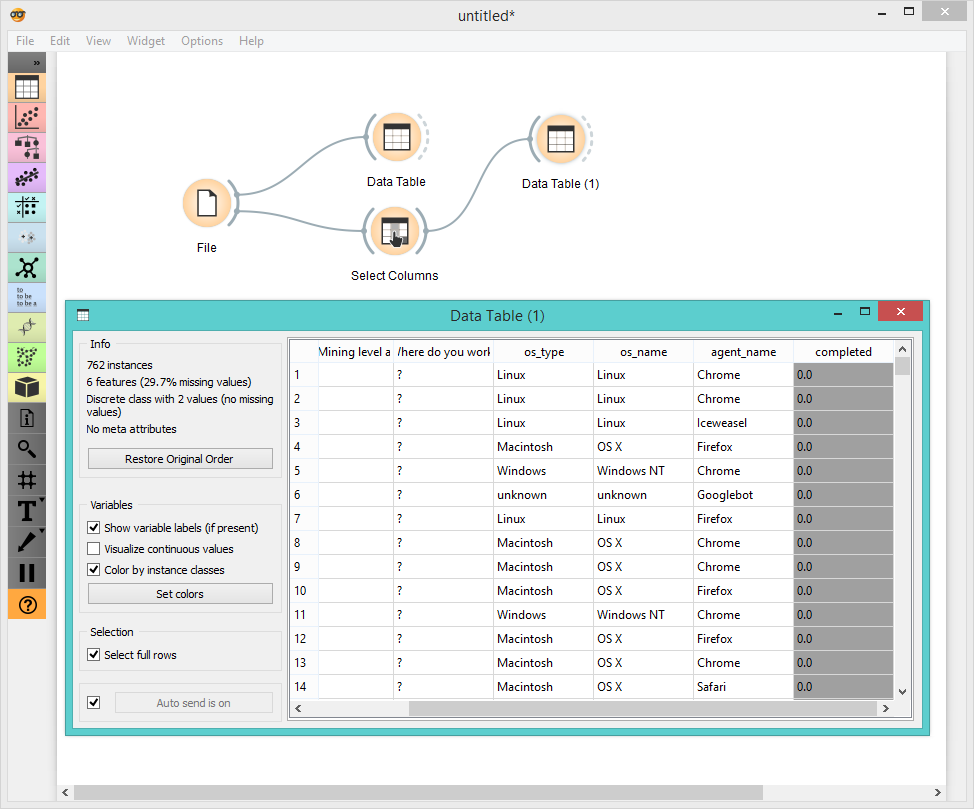
Now we would like to see some basic distributions from our data.
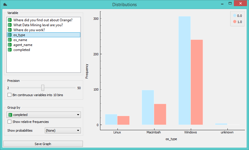
Interesting. Most of our users are working on Windows, a few on Mac and very few on Linux.
Let’s investigate further. Now we want to know more about those people who actually completed the survey. Let’s use Select Columns again, this time removing os_type, os_name, agent_name and completed from our data and keeping just the answers. We made “Where do you work?” our class variable, but we could use either one of the three. Another trick is to set in directly in Distributions widget under ‘Group by’.
Ok, let’s again use Distributions - this is such a simple way to get a good sense of your data.
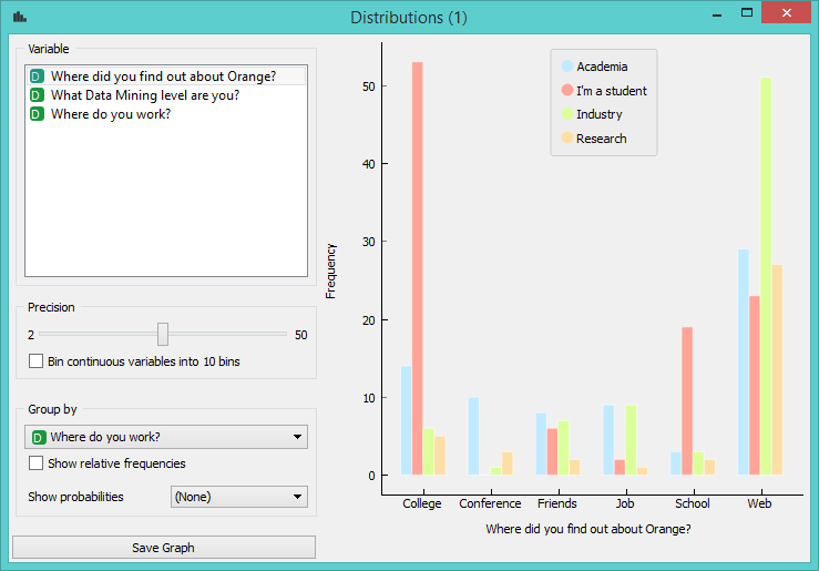
Obviously out of those who found out about Orange in college, most are students, but what’s interesting here is that there are so many. We can also see that out of those who found us on the web, most come from the private sector, followed by academia and researchers. Good. How about the other question?
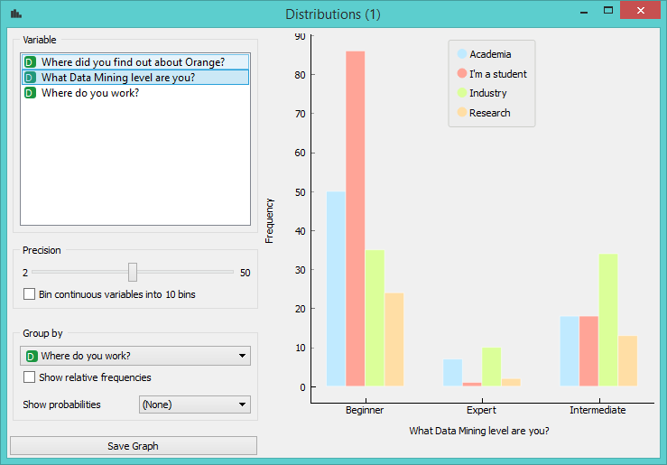
Again, results are not particularly shocking, but it’s great to confirm your hypothesis with real data. Out of beginner level data miners, most are students, while most intermediate users come from the industry.
A quick look at the Mosaic Display will give us a good overview:
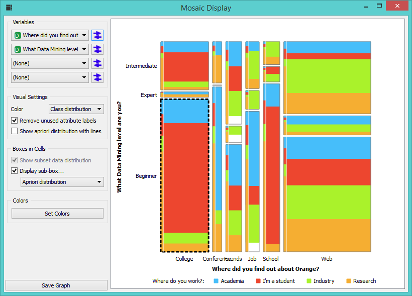
Yup, this sums it up quite nicely. We have lots of beginner levels users and not many expert ones (height of the box). Also most people found out about Orange on the web or in college (width of the box). A thin line on the left shows apriori distribution, thus making it easier to compare expected and actual number of instances. For example, there should be at least some people who are students and have found out about Orange at a conference. But there aren’t - a contrast between how much red there should be in the box (line on the left) and how much there actually is (bigger part of the box) is quite telling. We can even select all the beginner level users who found out about Orange in college and further inspect the data, but be it enough for now.
Our final workflow:
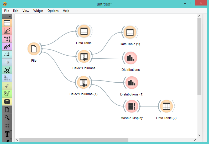
Obviously, this is a very simple analysis. But even such simple tasks are never boring with good visualization tools such as Distributions and Mosaic Display. You could also use Venn Diagram to find common features of selected subsets or perhaps Sieve Diagram for probabilities.
We are very happy to get these data and we would like to thank everyone who completed the survey. If you wish to help us further, please fill out a longer survey that won’t actually take you more than 3 minutes of your time (we timed it!).
Happy Friday everyone!
