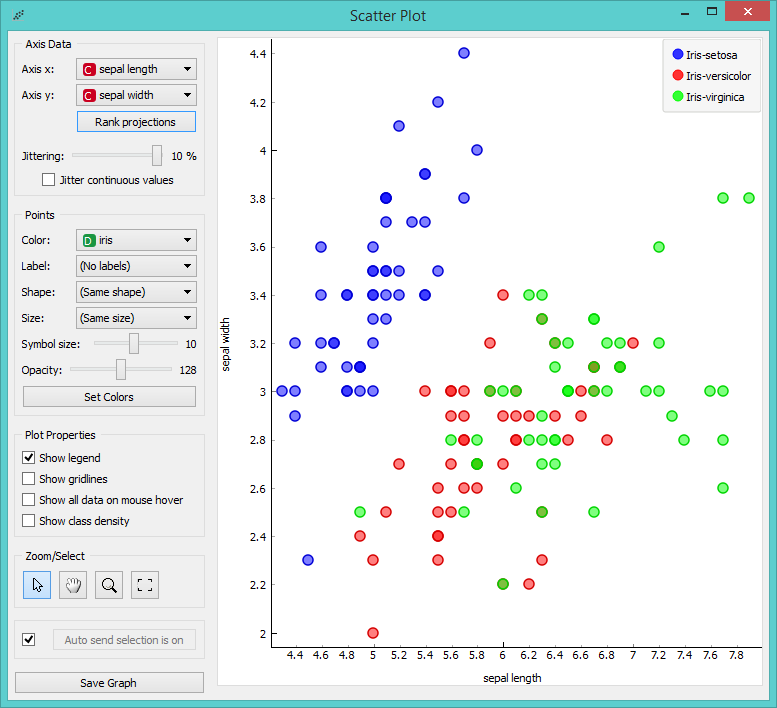
One of the nicest and surely most useful visualization widgets in Orange is Scatter Plot. The widget displays a 2-D plot, where x and y-axes are two attributes from the data.

2-dimensional scatter plot visualization
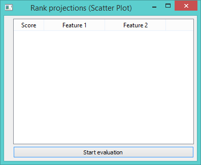
Orange 2.7 has a wonderful functionality called VizRank, that is now implemented also in Orange 3. Rank Projections functionality enables you to find interesting attribute pairs by scoring their average classification accuracy. Click ‘Start Evaluation’ to begin ranking.

Rank Projections before ranking is performed.
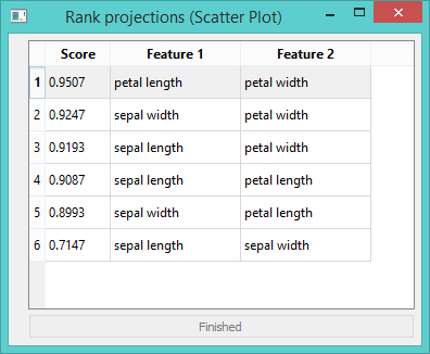
The functionality will also instantly adapt the visualization to the best scored pair. Select other pairs from the list to compare visualizations.

Rank Projections once the attribute pairs are scored.
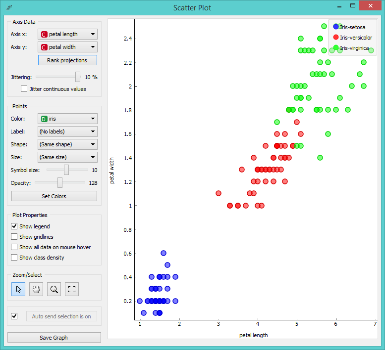
Rank suggested petal length and petal width as the best pair and indeed, the visualization below is much clearer (better separated).

Scatter Plot once the visualization is optimized.
Have fun trying out this and other visualization widgets!
