Today we will write about cluster analysis with Hierarchical Clustering widget. We use a well-known Iris data set, which contains 150 Iris flowers, each belonging to one of the three species (setosa, versicolor and virginica). To an untrained eye the three species are very alike, so how could we best tell them apart? The data set contains measurements of sepal and petal dimensions (width and length) and we assume that these gives rise to interesting clustering. But is this so?

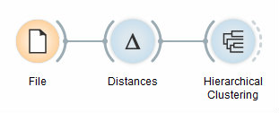
Hierarchical Clustering workflow
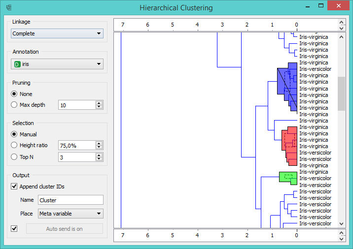
To find clusters, we feed the data from the File widget to Distances and then into Hierarchical Clustering. The last widget in our workflow visualizes hierarchical clustering dendrogram. In the dendrogram, let us annotate the branches with the corresponding Iris species (Annotation = Iris). We see that not all the clusters are composed of the same actual class - there are some mixed clusters with both virginicas and versicolors.

Selected clusters in Hierarchical Clustering widget
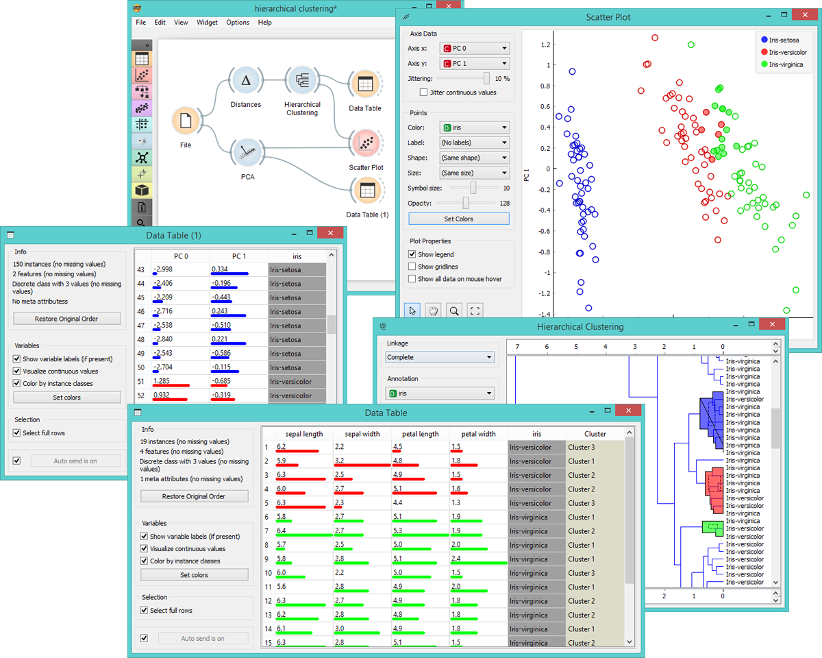
To see these clusters, we select them in Hierarchical Clustering widget by clicking on a branch. Selected data will be fed into the output of this widget. Let us inspect the data we have selected by adding Scatter Plot and PCA widgets. If we draw a Data Table directly from Hierarchical Clustering, we see the selected instances and the clusters they belong to. But if we first add the PCA widget, which decomposes the data into principal components, and then connect it to Scatter Plot, we will see the selected instances in the adjusted scatter plot (where principal components are used for x and y-axis).

Select other clusters in Hierarchical Clustering widget to see how the scatter plot visualization changes. This allows for an interesting explorative data analysis through a combination of widgets for unsupervised learning and visualizations.
