Paint Data widget might initially look like a kids’ game, but in combination with other Orange widgets it becomes a very simple and useful tool for conveying statistical concepts, such as k-means, hierarchical clustering and prediction models (like SVM, logistical regression, etc.).
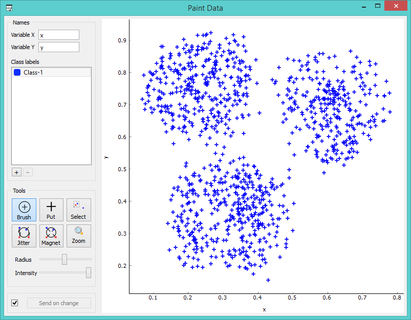
The widget enables you to draw your data on a 2-D plane. You can name the x and y axes, select the number of classes (which are represented by different colors) and then position the points on a graph.

Several painting tools allow you to manage your data set according to your specific needs; brush will paint several data instances at once, while put allows you paint a single data instance. Select a data subset and view it in the Data Table widget or zoom in to see the position of your points up close. Jitter and magnet are converse tools which allow either to spread the instances or draw them closer together.
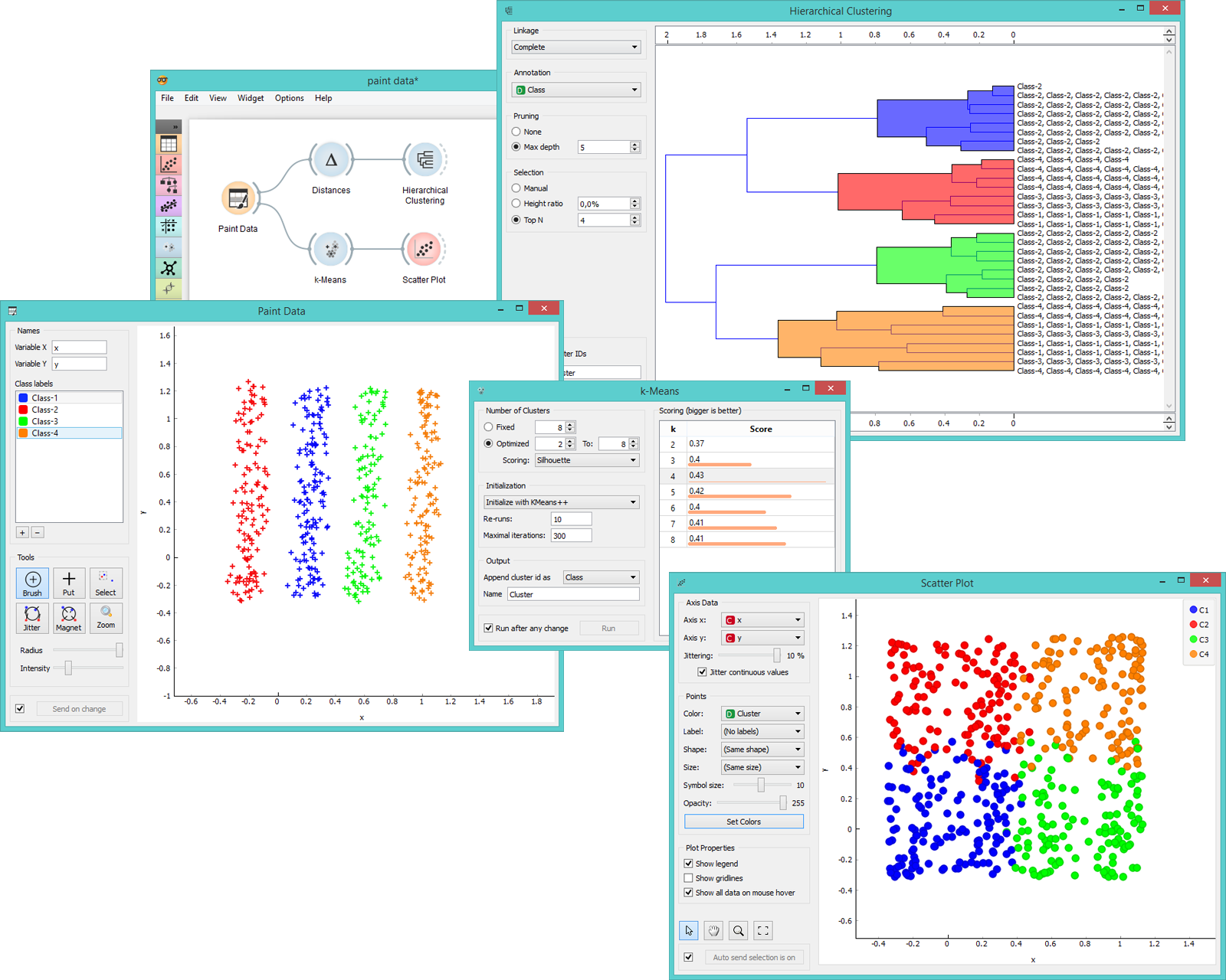
The data will be represented in a data table with two attributes, where their instances correspond to coordinates in the system. Such data set is great for demonstrating k-means and hierarchical clustering methods. Just like we do below. In the screenshot we see that k-means, with our particular settings, recognizes clusters way better than hierarchical clustering. It returns a score rank, where the best score (the one with the highest value) means the most likely number of clusters. Hierarchical clustering, however, doesn’t even group the right classes together.

Paint Data widget for comparing precision of k-means and hierarchical clustering methods.
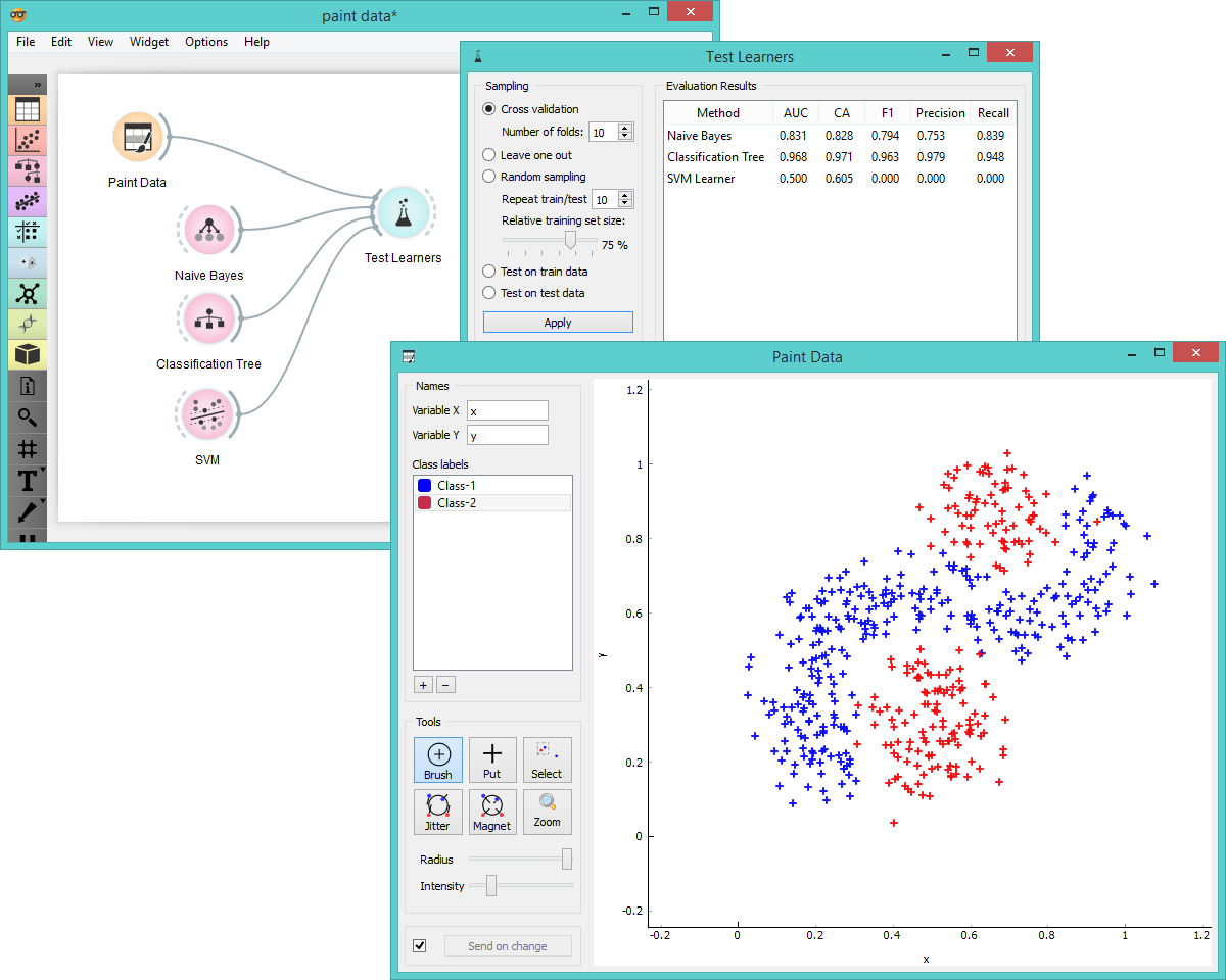
Another way to use Paint Data is to observe the performance of classification methods, where we can alter the graph to demonstrate improvement or deterioration of prediction models. By painting the data points we can try to construct the data set, which would be difficult for one but easy for another classifier. Say, why does linear SVM fail on the data set below?

Use Paint Data to compare prediction quality of several classifiers.
Happy painting!
